Sunday, March 30, 2008
The largest winning margins in first-class cricket
I've done the bulk of the work in putting together a comprehensive first-class database, containing all matches up until the end of the 2007 season. (There are a few holes near the end; some of the 2007/8 seasons started before the 2007 season finished.)
I will no doubt soon go back to statistical analysis, but for the next few posts I'll probably do statistical lists. Usually I find these boring, but since I don't know of such first-class lists online, I thought that they'd be of interest. If they are already on the Internet somewhere and you know where they are, please let me know.
We'll start with the largest margins of victory, first of all by innings.
Railways v Dera Ismail Khan, 1964/5: Railways 6dec/910 def. Dera Ismail Khan 32 & 27 (f/o) by an innings and 851 runs.
I have no idea how Dera Ismail Khan came to be classified as a first-class team. They clearly weren't one. In the 1980's they had another string of losses by an innings before their best performance, a loss by only a handful of runs to Hazara.
Victoria v Tasmania, 1922/3
Tas 217 & 176 lost to Vic 1059 by an innings and 666 runs. This was the match when Bill Ponsford made his 429.
There are quite a few Australian matches from the timeless era in these lists.
Victora v New South Wales, 1926/7
NSW 221 & 230 lost to Vic 1107 by an innings and 656 runs. Victoria's innings remains the highest ever in first-class cricket. Ponsford made 352.
New South Wales v South Australia, 1900/1
SA 157 & 156 lost to NSW 918 by an innings and 605 runs. Remarkably enough, the highest score in NSW's 918 was Syd Gregory's 168.
England v Australia, 1938
Eng 7dec/903 def. Aus 201 & 123 (f/o) by an innings and 579 runs. Hutton 364.
And now the top five by runs.
New South Wales v Queensland, 1929/30.
NSW 235 & 8dec/761 def. Qld 227 & 84 by 685 runs. Bradman 452 not out.
Australia v England, 1928/9.
Eng 521 & 8dec/342 def. Aus 122 & 66 by 675 runs. Bradman's Test debut.
South Australia v New South Wales, 1920/1
NSW 304 & 770 def. SA 265 & 171 by 638 runs.
Muslim Commercial Bank v Water and Power Development Authority
MCBA 575 & 0dec/282 def. WPDA 98 & 150 by 609 runs.
Sargodha v Lahore Municipal Corporation
Sar 336 & 416 def. LMC 77 & 90 by 585 runs.
On an unrelated note, there are a few games from the early parts of the 19th century where either some players, whole teams, or even the team scores are unknown. Such gaps in the first-class record looked to have ended in 1829, but they made a re-appearance in Sri Lanka in the 1990's. 1, 2 (Colombo only had eight players!), 3, 4. That last match was in 1999.
I won't be counting any of these incomplete scorecards for my stats.
Tuesday, March 25, 2008
Toiling away
Soulberry asked for the best fast bowlers on flat pitches since 1970. Defining a flat pitch is not easy, so I've taken a short-cut to make my life easier. I've just totted up the averages for bowlers in innings where the opposition scores at least 450. It's a bit artificial, but it should do.
Here we go. This is actually all Test bowlers, qualification 15 wickets in these high-scoring innings. They're ranked by the weighted averages, where wickets are weighted by the average of the batsmen dismissed. This is particularly useful in this exercise, as we're not interested in who picks up cheap tail-end wickets. I've bolded the bowlers who satisfy Soulberry's criteria.
I'm not sure how much I'd want to read into these numbers, since the wicket tallies are generally quite low. But Shaun Pollock looks like he deserves to be near the top.
And now the bottom end:
Here we go. This is actually all Test bowlers, qualification 15 wickets in these high-scoring innings. They're ranked by the weighted averages, where wickets are weighted by the average of the batsmen dismissed. This is particularly useful in this exercise, as we're not interested in who picks up cheap tail-end wickets. I've bolded the bowlers who satisfy Soulberry's criteria.
name              runs  wkts  wtd wkts  avg     wtd avg
Mushtaq Mohammad  629   21    21,2      29,95   29,61
WJ O'Reilly       932   24    29,6      38,83   31,53
MW Tate           1124  30    34,2      37,47   32,83
C White           792   17    23,6      46,59   33,63
SM Pollock        1376  40    40,2      34,40   34,20
NJN Hawke         629   18    18,3      34,94   34,32
MHN Walker        552   15    15,3      36,80   36,01
RGD Willis        1386  33    38,4      42,00   36,09
BA Reid           867   24    23,9      36,13   36,31
JN Gillespie      871   17    22,9      51,24   38,07
M Dillon          1413  28    37,0      50,46   38,21
DK Lillee         956   26    24,8      36,77   38,52
B Lee             1191  27    30,4      44,11   39,23
JC Laker          846   20    21,5      42,30   39,29
CEL Ambrose       667   16    16,9      41,69   39,40
CE Cuffy          571   15    14,5      38,07   39,49
DA Allen          966   20    24,4      48,30   39,66
AJ Bell           503   15    12,5      33,53   40,21
DR Hadlee         890   19    22,1      46,84   40,25
FS Trueman        644   15    16,0      42,93   40,38
I'm not sure how much I'd want to read into these numbers, since the wicket tallies are generally quite low. But Shaun Pollock looks like he deserves to be near the top.
And now the bottom end:
EAS Prasanna      1573  21    21,8      74,90   72,02
GS Sobers         1520  21    20,9      72,38   72,73
Mohammad Sami     1507  17    20,6      88,65   73,26
SJ Harmison       1825  24    24,9      76,04   73,32
SP Gupte          1120  18    15,1      62,22   74,17
DL Underwood      1593  18    21,2      88,50   75,11
FH Edwards        1136  15    15,1      75,73   75,38
PCR Tufnell       1339  15    16,3      89,27   82,35
Mushtaq Ahmed     1266  15    15,1      84,40   83,62
RJ Shastri        1719  17    19,4      101,12  88,52
Friday, March 21, 2008
What is a chuck?
This is a bit different from my usual fare, but I thought it deserved its own post, rather than just being in a couple of comments threads around the place. Thanks to AGB commenter Professor Rosseforp for bringing my attention to the Ferdinands and Kersting paper.
For a long time, the definition of an illegal delivery action was that the ball couldn't be thrown or jerked. (Stuart gave us details here and here.)
A recent paper suggests that we might be able to return to a sort of 'jerkiness' definition, only this time backed up by some science. I'll go through a bit of background first. The key goal that we want is for science to come up with a criterion whereby bowlers who look like chuckers are chuckers. An exception to this is Murali, who can bowl in a brace (so he can't possibly chuck) and still look bad. But the problem of a chucking definition is much bigger than just Murali, and it should be possible to get science to agree with the naked eye, at least most of the time, for bowlers with 'normal' arms.
The ICC's current tolerance of 15 degree elbow straightening (or 'extension'? not really sure of the difference) was based on a study done by Porter, Elliott, and Hurrion during the 2004 Champions Trophy. Unfortunately, the full details of the study haven't been released to the general public. The reason given by the ICC is confidentiality issues: "We do not think it would be correct to release the figures publicly without the prior consent of the individual bowlers and the researchers themselves. This consent has not been obtained."
I don't understand why the researchers, who have published many biomechanics studies publicly, should care. I can see why the ICC might not want to give names and elbow straightenings, because there'd be a torrent of allegations of chucking all over the place.
Nevertheless, the ICC's secrecy over the matter means that we don't really know much about elbow straightenings, except that Sarwan's was zero, and Pollock and McGrath up to 12 degrees or so.
But luckily there was a paper published (in Sports Biomechanics, 'Fast Bowling Arm Actions and the Illegal Delivery Law in Men's High Performance Cricket Matches') by Portus, Rosemond, and Rath in 2006 which does give us some numbers. They also don't name names, but they did study thirty-four deliveries by twenty-one fast bowlers, from Test, ODI, and tour matches. None of the bowlers had had any questions raised over their actions. These sorts of analyses take a long time, which is why so few balls were studied.
The errors in the measurements are +/- 1 degree.
Of the thirty-four balls bowled, three were by two bowlers with hyperextended elbows, so we'll ignore them. Of the remaining thirty-one, six had elbow straightenings larger than 15 degrees. These were spread across four bowlers out of nineteen. If you go by the 15-degree rule, then those are chucks. Many of the bowlers only had one ball recorded, so it's not clear if there were any more chuckers-under-the-15-degree-rule in the sample. Looking at the numbers in the table, you'd guess that at least a couple of them go past 15 degrees sometimes.
So, to summarise: Under the 15-degree rule, one in four or five fast bowlers sometimes chuck, often more than once per over.
These are, remember, bowlers whose actions haven't been questioned.
So here we have the first problem of the 15-degree rule: many bowlers who should be deemed legitimate are breaking the rule.
Now we get onto the other problem of the 15-degree rule: you can chuck without straightening your elbow 15 degrees.
This takes us to the paper by Ferdinands and Kersting, also published in Sports Biomechanics, in 2007 ('An evaluation of biomechanical measures of bowling action legality in cricket'). The technical details are a bit over my head, but this is what they say:
If bowlers adopted a similar action to throwing, where the elbow remains flexed at release, then it may be possible to utilize effective humeral internal rotation in bowling while satisfying the current 15° elbow extension angle limit. For instance, if in bowling the elbow can be flexed 26° at release, which has been achieved in professional Cuban baseball pitchers (Escamilla et al., 2001), then a bowler can theoretically have an elbow flexion angle of 41° and extend 15° before ball release. Any amount of elbow extension is allowed after release. Such a bowling technique would use a bowling arm with a lower absolute elbow angle about the flexion-extension axis (more flexed), which would extend rapidly before and after release. This technique would share some of the characteristics of a throwing-type action, but still remain legal according to the current elbow extension angle limit.
But it's not just speculation about new 'bowling' techniques that would be blatant chucks without breaking 15 degrees. Ferdinands and Kersting studied bowlers (in the lab, not in match conditions) from club level in New Zealand to international level, some of whom had had their actions reported. There were 'fast' bowlers and spinners. One of the limitations of the study is that their 'fast' bowlers weren't fast by international standards, and this is the obvious place where the next bit of research should go.
There were six bowlers studied with suspect actions. Five of these had mean elbow extensions less than 15 degrees, and indeed at least 75% of the balls bowled by those with suspect actions passed the 15 degree test (it's not clear precisely how many from the graphs).
Let's have a look at the box-and-whisker plot for the various groups considered:
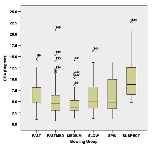
The boxes represent the middle 50% of deliveries, in terms of how much elbow extension there is. The horizontal lines in them show the medians.
The suspect box starts higher and finishes higher than the others (so there is some correlation between elbow straightening and apparent chucking), but there's a big overlap with spinners and fast bowlers. So just going by the elbow straightening isn't very good at distinguishing those with bad-looking actions from those with clean actions.
Now (at last!) here comes the key point. In addition to just measuring the total straightening, they also measured the rate of the elbow extension, the 'elbow extension angular velocity'. Now the box-and-whisker plot clearly shows up the chuckers:
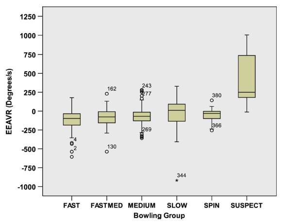
The bottom of the suspect box is at around 200 degrees per second, and the top of any of the other boxes is around 100 degrees per second.
The implication is clear: measuring the elbow extension angular velocity gives much, much better agreement with the naked eye than just going by the total straughtening. It's not perfect, and there were some deliveries in the non-suspect groups that went above their suggested threshold of 200 degrees per second, but it's a lot better than what we currently do. And importantly, it gives us an objective definition that generally agrees with what our eyes tell us is a clean action and what is not.
As I said earlier, we need to see this research done on a large group of international-class bowlers before applying it to international cricket. But the results are very promising. At the very least, the 200-degree-per-second cutoff is better than the 15-degree cutoff, which clearly doesn't work.
I'll finish by noting that this gets back to the old 'jerk' definition. A gradual straightening caused by general stress on the elbow during the bowling action isn't jerky, but a rapid bit of straightening just before release is jerky.
For a long time, the definition of an illegal delivery action was that the ball couldn't be thrown or jerked. (Stuart gave us details here and here.)
A recent paper suggests that we might be able to return to a sort of 'jerkiness' definition, only this time backed up by some science. I'll go through a bit of background first. The key goal that we want is for science to come up with a criterion whereby bowlers who look like chuckers are chuckers. An exception to this is Murali, who can bowl in a brace (so he can't possibly chuck) and still look bad. But the problem of a chucking definition is much bigger than just Murali, and it should be possible to get science to agree with the naked eye, at least most of the time, for bowlers with 'normal' arms.
The ICC's current tolerance of 15 degree elbow straightening (or 'extension'? not really sure of the difference) was based on a study done by Porter, Elliott, and Hurrion during the 2004 Champions Trophy. Unfortunately, the full details of the study haven't been released to the general public. The reason given by the ICC is confidentiality issues: "We do not think it would be correct to release the figures publicly without the prior consent of the individual bowlers and the researchers themselves. This consent has not been obtained."
I don't understand why the researchers, who have published many biomechanics studies publicly, should care. I can see why the ICC might not want to give names and elbow straightenings, because there'd be a torrent of allegations of chucking all over the place.
Nevertheless, the ICC's secrecy over the matter means that we don't really know much about elbow straightenings, except that Sarwan's was zero, and Pollock and McGrath up to 12 degrees or so.
But luckily there was a paper published (in Sports Biomechanics, 'Fast Bowling Arm Actions and the Illegal Delivery Law in Men's High Performance Cricket Matches') by Portus, Rosemond, and Rath in 2006 which does give us some numbers. They also don't name names, but they did study thirty-four deliveries by twenty-one fast bowlers, from Test, ODI, and tour matches. None of the bowlers had had any questions raised over their actions. These sorts of analyses take a long time, which is why so few balls were studied.
The errors in the measurements are +/- 1 degree.
Of the thirty-four balls bowled, three were by two bowlers with hyperextended elbows, so we'll ignore them. Of the remaining thirty-one, six had elbow straightenings larger than 15 degrees. These were spread across four bowlers out of nineteen. If you go by the 15-degree rule, then those are chucks. Many of the bowlers only had one ball recorded, so it's not clear if there were any more chuckers-under-the-15-degree-rule in the sample. Looking at the numbers in the table, you'd guess that at least a couple of them go past 15 degrees sometimes.
So, to summarise: Under the 15-degree rule, one in four or five fast bowlers sometimes chuck, often more than once per over.
These are, remember, bowlers whose actions haven't been questioned.
So here we have the first problem of the 15-degree rule: many bowlers who should be deemed legitimate are breaking the rule.
Now we get onto the other problem of the 15-degree rule: you can chuck without straightening your elbow 15 degrees.
This takes us to the paper by Ferdinands and Kersting, also published in Sports Biomechanics, in 2007 ('An evaluation of biomechanical measures of bowling action legality in cricket'). The technical details are a bit over my head, but this is what they say:
If bowlers adopted a similar action to throwing, where the elbow remains flexed at release, then it may be possible to utilize effective humeral internal rotation in bowling while satisfying the current 15° elbow extension angle limit. For instance, if in bowling the elbow can be flexed 26° at release, which has been achieved in professional Cuban baseball pitchers (Escamilla et al., 2001), then a bowler can theoretically have an elbow flexion angle of 41° and extend 15° before ball release. Any amount of elbow extension is allowed after release. Such a bowling technique would use a bowling arm with a lower absolute elbow angle about the flexion-extension axis (more flexed), which would extend rapidly before and after release. This technique would share some of the characteristics of a throwing-type action, but still remain legal according to the current elbow extension angle limit.
But it's not just speculation about new 'bowling' techniques that would be blatant chucks without breaking 15 degrees. Ferdinands and Kersting studied bowlers (in the lab, not in match conditions) from club level in New Zealand to international level, some of whom had had their actions reported. There were 'fast' bowlers and spinners. One of the limitations of the study is that their 'fast' bowlers weren't fast by international standards, and this is the obvious place where the next bit of research should go.
There were six bowlers studied with suspect actions. Five of these had mean elbow extensions less than 15 degrees, and indeed at least 75% of the balls bowled by those with suspect actions passed the 15 degree test (it's not clear precisely how many from the graphs).
Let's have a look at the box-and-whisker plot for the various groups considered:

The boxes represent the middle 50% of deliveries, in terms of how much elbow extension there is. The horizontal lines in them show the medians.
The suspect box starts higher and finishes higher than the others (so there is some correlation between elbow straightening and apparent chucking), but there's a big overlap with spinners and fast bowlers. So just going by the elbow straightening isn't very good at distinguishing those with bad-looking actions from those with clean actions.
Now (at last!) here comes the key point. In addition to just measuring the total straightening, they also measured the rate of the elbow extension, the 'elbow extension angular velocity'. Now the box-and-whisker plot clearly shows up the chuckers:

The bottom of the suspect box is at around 200 degrees per second, and the top of any of the other boxes is around 100 degrees per second.
The implication is clear: measuring the elbow extension angular velocity gives much, much better agreement with the naked eye than just going by the total straughtening. It's not perfect, and there were some deliveries in the non-suspect groups that went above their suggested threshold of 200 degrees per second, but it's a lot better than what we currently do. And importantly, it gives us an objective definition that generally agrees with what our eyes tell us is a clean action and what is not.
As I said earlier, we need to see this research done on a large group of international-class bowlers before applying it to international cricket. But the results are very promising. At the very least, the 200-degree-per-second cutoff is better than the 15-degree cutoff, which clearly doesn't work.
I'll finish by noting that this gets back to the old 'jerk' definition. A gradual straightening caused by general stress on the elbow during the bowling action isn't jerky, but a rapid bit of straightening just before release is jerky.
Thursday, March 20, 2008
Adjusting averages for not-outs, take three
This is my third attempt to implement a good method to deal with no-outs when calculating batting averages. The first two happened before this blog started (I've backdated one here), but both had flaws. The flaw in the one I just linked to is a subtle one, and I only realised it after reading this post by Charles Davis.
He was interested in calculating the average number of runs scored once you reach a century. This is basically the same question I have in projecting not-outs forward. If a batsman who averages 40 finishes 100 not out, how many extra runs would he have scored?
The way I did this originally was like this:
1. Take all innings greater than or equal to 100.
2. Take their average.
3. Subtract 100.
This seems reasonable, but Davis points out an anomaly. Suppose a batsman has scores of 100 not out, 100 not out, and 100. Then his average calculated by this method is 300 - 100 = 200. But he's never scored a run past 100. So what the procedure should be is:
1. Take all innings greater than or equal to 100.
2. Subtract 100 from each.
3. Take their average.
Now this example is extreme, but the problem is a significant one when you do this over all batsmen at all scores, because there are a lot of not-outs at each score. If you're interested, compare the graph below to the bad one in my earlier post.
For this graph, I took each batsman with a Test average of at least 40, and computed their average increases at each run (up to their highest score), and then took the average over all players at each score. If a batsman's highest score was a not-out, I added the batsman's average to it and turned it into an 'out'.
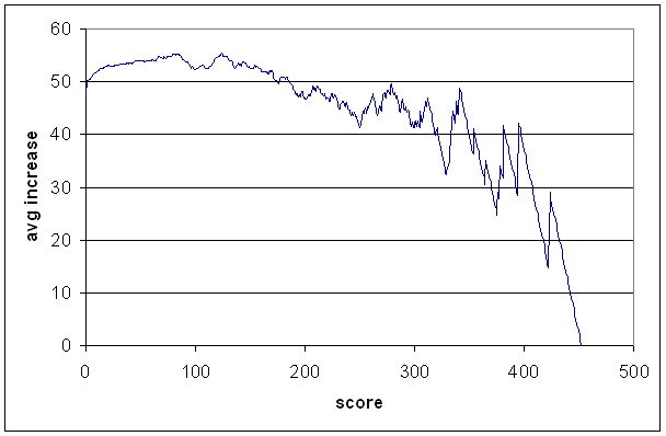
The average increase from zero (i.e., the overall average) is 47,5. The average increase from 1 is 49,8. So in a sense, your first run is worth three. This, along with the steady increase in the curve that you see until about 85, is just the effect of getting your eye in, and batting becoming easier as you continue to score runs.
The dip either side of 100 is what you might call a psychological feature — it's there because batsmen often drop their concentration once reaching a century and get out soon afterwards. The curve rises again until about 125, and then there's a pretty steady downward trend, with two more psychological dips around 200 and 250. There also looks to be one around 300, but there aren't many data points there.
The curve has a lot of noise in it, and before using it to project not-outs forward, it's worth smoothing out the non-psychological bits. I didn't spend too much time doing this, and there are a couple of ugly splices, and in one place scoring a run actually sends you backwards by one run. That shouldn't be too serious in the grand scheme of things.
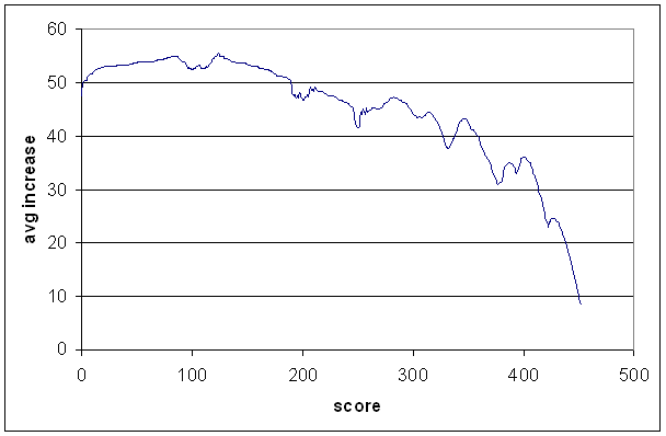
Now, you wouldn't want to just use this curve to project not-outs, because obviously some batsmen are better than others at making large scores. Steve Waugh v Mark Waugh is an obvious example. On the other hand, if you're projecting a not-out, and there's only one innings higher to work with, then that higher innings is probably not representative, and it's useful to use the overall average increase given in the graph.
Note that when using the graph on an individual batsman, I move it up or down so that the average increase from zero matches his average.
To compromise between just going by the individual and just going by the graph, I used the following formula, where n is the number of innings larger than the not-out to be projected:
proj = 1/sqrt(n+1) * proj_by_individual + (1 - 1/sqrt(n+1)) * proj_by_overall.
The co-efficients here are arbitrary, but I think they look OK. If there's one innings to work with, it gets about a 30% weight, and the graph gets 70% weight. If there are three innings, it's 50-50.
Now for some results. In the following table I've listed the top 20 batsmen as measured by this adjusted average. There's no adjustment for era or quality of bowling. The 'diff' is the difference between regular average and adjusted average. It's positive is the regular average is higher (i.e., inflated by not-outs), and negative if the regular average is lower (deflated by not-outs). The rank is the rank by regular average, which lets you see how the batsmen have shuffled around. Qualification 20 innings.
Overall there's not much change. Hammand and Sobers move up several places, but otherwise we're dealing with fairly small adjustments to the average.
Mike Hussey's adjustment is the largest of any batsman with an average over 40. That adjustment will likely come down as his career continues and his stats become more like those of other players.
Considering only batsmen who average over 40 with at least 50 innings, the average difference is -0,16. So on average, not-outs deflate averages by about a sixth of a run. There's a very slight (and noisy) trend saying that batsmen with a high proportion of not-outs have their averages deflated more, which also agrees with the idea that not-outs tend to deflate averages.
As I said, there's a lot of noise. In that latter dataset, there are 52 batsmen whose averages seem to be inflated by not-outs and 75 whose averages are deflated. But in almost all cases the differences are pretty small.
The moral of the story is not to worry about not-outs when looking at a batsman's stats.
One last comment. A paper by Clive Loader in 1996 considered Allan Border's career and the effects of not-outs on his average. It was only one example in the paper, which looked at something called censoring in various contexts. Using some kind of binomial model, he estimated that not-outs had deflated Border's average by between 1 or 2 runs. My numbers say that his average was inflated by about two fifths of a run. An unfortunate disagreement, and I probably won't get to the bottom of it without learning a good deal more statistics, because that paper uses methods beyond my current knowledge.
He was interested in calculating the average number of runs scored once you reach a century. This is basically the same question I have in projecting not-outs forward. If a batsman who averages 40 finishes 100 not out, how many extra runs would he have scored?
The way I did this originally was like this:
1. Take all innings greater than or equal to 100.
2. Take their average.
3. Subtract 100.
This seems reasonable, but Davis points out an anomaly. Suppose a batsman has scores of 100 not out, 100 not out, and 100. Then his average calculated by this method is 300 - 100 = 200. But he's never scored a run past 100. So what the procedure should be is:
1. Take all innings greater than or equal to 100.
2. Subtract 100 from each.
3. Take their average.
Now this example is extreme, but the problem is a significant one when you do this over all batsmen at all scores, because there are a lot of not-outs at each score. If you're interested, compare the graph below to the bad one in my earlier post.
For this graph, I took each batsman with a Test average of at least 40, and computed their average increases at each run (up to their highest score), and then took the average over all players at each score. If a batsman's highest score was a not-out, I added the batsman's average to it and turned it into an 'out'.

The average increase from zero (i.e., the overall average) is 47,5. The average increase from 1 is 49,8. So in a sense, your first run is worth three. This, along with the steady increase in the curve that you see until about 85, is just the effect of getting your eye in, and batting becoming easier as you continue to score runs.
The dip either side of 100 is what you might call a psychological feature — it's there because batsmen often drop their concentration once reaching a century and get out soon afterwards. The curve rises again until about 125, and then there's a pretty steady downward trend, with two more psychological dips around 200 and 250. There also looks to be one around 300, but there aren't many data points there.
The curve has a lot of noise in it, and before using it to project not-outs forward, it's worth smoothing out the non-psychological bits. I didn't spend too much time doing this, and there are a couple of ugly splices, and in one place scoring a run actually sends you backwards by one run. That shouldn't be too serious in the grand scheme of things.

Now, you wouldn't want to just use this curve to project not-outs, because obviously some batsmen are better than others at making large scores. Steve Waugh v Mark Waugh is an obvious example. On the other hand, if you're projecting a not-out, and there's only one innings higher to work with, then that higher innings is probably not representative, and it's useful to use the overall average increase given in the graph.
Note that when using the graph on an individual batsman, I move it up or down so that the average increase from zero matches his average.
To compromise between just going by the individual and just going by the graph, I used the following formula, where n is the number of innings larger than the not-out to be projected:
proj = 1/sqrt(n+1) * proj_by_individual + (1 - 1/sqrt(n+1)) * proj_by_overall.
The co-efficients here are arbitrary, but I think they look OK. If there's one innings to work with, it gets about a 30% weight, and the graph gets 70% weight. If there are three innings, it's 50-50.
Now for some results. In the following table I've listed the top 20 batsmen as measured by this adjusted average. There's no adjustment for era or quality of bowling. The 'diff' is the difference between regular average and adjusted average. It's positive is the regular average is higher (i.e., inflated by not-outs), and negative if the regular average is lower (deflated by not-outs). The rank is the rank by regular average, which lets you see how the batsmen have shuffled around. Qualification 20 innings.
name          inns  no  runs  avg    adj    diff   rank
DG Bradman    80    10  6996  99,94  99,38  +0,57  1
MEK Hussey    36    8   2188  78,14  74,25  +3,90  2
RG Pollock    41    4   2256  60,97  61,60  -0,63  3
GA Headley    40    4   2190  60,83  60,95  -0,12  4
WR Hammond    140   16  7249  58,46  60,04  -1,58  10
H Sutcliffe   84    9   4555  60,73  59,62  +1,11  5
GS Sobers     160   21  8032  57,78  59,02  -1,24  11
E Paynter     31    5   1540  59,23  58,80  +0,44  6
RT Ponting    191   26  9676  58,64  58,76  -0,11  8
ED Weekes     81    5   4455  58,62  58,49  +0,13  9
KF Barrington 131   15  6806  58,67  57,83  +0,84  7
KC Sangakkara 114   10  5914  56,87  57,18  -0,32  14
SR Tendulkar  236   26  11851 56,43  57,06  -0,63  18
L Hutton      138   15  6971  56,68  57,06  -0,38  16
JH Kallis     195   32  9394  57,63  56,78  +0,85  12
CL Walcott    74    7   3798  56,69  56,53  +0,16  15
JB Hobbs      102   7   5410  56,95  56,51  +0,43  13
RS Dravid     202   25  10015 56,58  56,45  +0,13  17
Mohd Yousuf   138   12  7009  55,63  55,59  +0,04  19
VG Kambli     21    1   1084  54,20  54,55  -0,35  22
Overall there's not much change. Hammand and Sobers move up several places, but otherwise we're dealing with fairly small adjustments to the average.
Mike Hussey's adjustment is the largest of any batsman with an average over 40. That adjustment will likely come down as his career continues and his stats become more like those of other players.
Considering only batsmen who average over 40 with at least 50 innings, the average difference is -0,16. So on average, not-outs deflate averages by about a sixth of a run. There's a very slight (and noisy) trend saying that batsmen with a high proportion of not-outs have their averages deflated more, which also agrees with the idea that not-outs tend to deflate averages.
As I said, there's a lot of noise. In that latter dataset, there are 52 batsmen whose averages seem to be inflated by not-outs and 75 whose averages are deflated. But in almost all cases the differences are pretty small.
The moral of the story is not to worry about not-outs when looking at a batsman's stats.
One last comment. A paper by Clive Loader in 1996 considered Allan Border's career and the effects of not-outs on his average. It was only one example in the paper, which looked at something called censoring in various contexts. Using some kind of binomial model, he estimated that not-outs had deflated Border's average by between 1 or 2 runs. My numbers say that his average was inflated by about two fifths of a run. An unfortunate disagreement, and I probably won't get to the bottom of it without learning a good deal more statistics, because that paper uses methods beyond my current knowledge.
Sunday, March 16, 2008
Teams with good spinners bat well against spin and pace.
It's useful to check the common wisdom, or things that seem obvious. Often they're true, but sometimes they're not, and even if true, sometimes an analysis reveals surprising related results. This post falls into the latter category.
If a team has good spinners, then their batsmen should do better when playing against spinners. This might be because the country generally produces lots of spinners and so batsmen grow up playing lots of them, or because the batsmen get to practice in the nets against good spinners, or some combination of the two. The same principle should apply to pace bowling.
So let's check. I went to Statsguru and got each of the top eight teams's averages against pacemen, and each team's overall pacemen's average. To start, I considered only the 2000's. The results are plotted below:
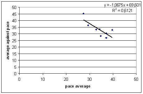
That's quite a strong trend, but the direction agrees with the common sense — teams whose pace bowlers have high averages don't score as many runs against pace bowlers, and vice versa. As I said, the trend is very strong, and much of this is due to the luck of world cricket over the past decade. Australia has had excellent batsmen and excellent pacemen, the West Indies the opposite. I repeated the exercise for earlier decades (90's, 80's, and 70's; the results for the 1960's go a bit haywire because three out of the seven teams were weak), and the direction of the trend is the same, but the magnitude varied from a slope of -0.17 to -0.8.
Still, a verification of what we thought we knew, and some ideas of how strong the effect is. Now let's do the same for spinners.
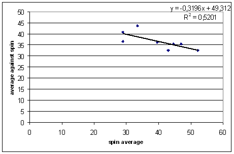
The same basic trend, though with a gentler slope. The results for the earlier decades are similar, with the slopes ranging from -0.3 (the one shown above) to -0.75.
Now let's see if we can get null results. If a team has good pacemen, that should tell us nothing about how well they play spin, right?
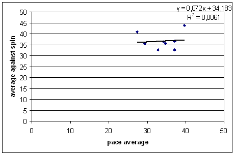
Right. No trend at all.
Similarly, if a team has good spinners, that should tell us nothing about how they play pace.
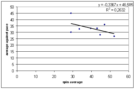
Erm, wrong. Teams with good spinners tend to play pace well. The same trend exists for the earlier decades, with slopes ranging from -0.18 to -0.33 (above). I don't know what the p-value is, but it looks like it's not just luck.
I don't know how to explain this. I have two ideas:
1) learning how to play high-quality spin makes you a better batsman in general;
2) spinners with good pacemen in the team do better than those without, and so the trend is really just "average against pace" v "pace average" in disguise.
I'm inclined to think that the second of these two ideas is a strong factor, but there's no correlation between spin average and pace average in either of the last two decades. For the 2000's:
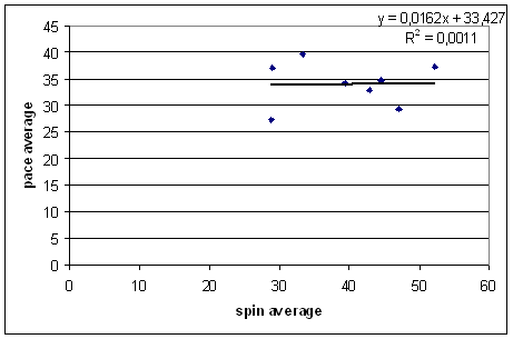
For the 1980's and 1970's, there is a positive correlation between the two.
From my post on bowler support, a useful rule of thumb in dealing with aggregated data like this is that for every run lower a bowler's teammates' bowling averages are, the bowler's average should go down by a quarter of a run. This works pretty well for the 1980's and 1970's graphs, but doesn't help explain what's going on in the last two decades.
It's a bit of a puzzle, and I don't know what the answer is. Teams that have good spinners tend to play pace well.
(A post-script: I was going to do another post on captaincy today, based on some suggestions from The Atheist, but my regression failed rather miserably. I'll have another try later.)
If a team has good spinners, then their batsmen should do better when playing against spinners. This might be because the country generally produces lots of spinners and so batsmen grow up playing lots of them, or because the batsmen get to practice in the nets against good spinners, or some combination of the two. The same principle should apply to pace bowling.
So let's check. I went to Statsguru and got each of the top eight teams's averages against pacemen, and each team's overall pacemen's average. To start, I considered only the 2000's. The results are plotted below:

That's quite a strong trend, but the direction agrees with the common sense — teams whose pace bowlers have high averages don't score as many runs against pace bowlers, and vice versa. As I said, the trend is very strong, and much of this is due to the luck of world cricket over the past decade. Australia has had excellent batsmen and excellent pacemen, the West Indies the opposite. I repeated the exercise for earlier decades (90's, 80's, and 70's; the results for the 1960's go a bit haywire because three out of the seven teams were weak), and the direction of the trend is the same, but the magnitude varied from a slope of -0.17 to -0.8.
Still, a verification of what we thought we knew, and some ideas of how strong the effect is. Now let's do the same for spinners.

The same basic trend, though with a gentler slope. The results for the earlier decades are similar, with the slopes ranging from -0.3 (the one shown above) to -0.75.
Now let's see if we can get null results. If a team has good pacemen, that should tell us nothing about how well they play spin, right?

Right. No trend at all.
Similarly, if a team has good spinners, that should tell us nothing about how they play pace.

Erm, wrong. Teams with good spinners tend to play pace well. The same trend exists for the earlier decades, with slopes ranging from -0.18 to -0.33 (above). I don't know what the p-value is, but it looks like it's not just luck.
I don't know how to explain this. I have two ideas:
1) learning how to play high-quality spin makes you a better batsman in general;
2) spinners with good pacemen in the team do better than those without, and so the trend is really just "average against pace" v "pace average" in disguise.
I'm inclined to think that the second of these two ideas is a strong factor, but there's no correlation between spin average and pace average in either of the last two decades. For the 2000's:

For the 1980's and 1970's, there is a positive correlation between the two.
From my post on bowler support, a useful rule of thumb in dealing with aggregated data like this is that for every run lower a bowler's teammates' bowling averages are, the bowler's average should go down by a quarter of a run. This works pretty well for the 1980's and 1970's graphs, but doesn't help explain what's going on in the last two decades.
It's a bit of a puzzle, and I don't know what the answer is. Teams that have good spinners tend to play pace well.
(A post-script: I was going to do another post on captaincy today, based on some suggestions from The Atheist, but my regression failed rather miserably. I'll have another try later.)
Tuesday, March 11, 2008
Evaluating captaincy
Captaincy is one area of cricket that does not receive much statistical scrutiny. It is not hard to figure out why — about the only thing you could easily compute would be how many wins the team had, and this figure is strongly dependent on the quality of the team. To remedy this, I've come up with a way of estimating how many wins, draws, and losses that a captain would be expected to have, given the strength of his side, the strength of the opponents, and whether they're at home or away. Once we have these, we can compare to the captain's actual record, and see who does better or worse.
First, I'll explain how to get the expected results. This method is a bit rough and can certainly be improved in places, but overall I think it does a good job. For each team, I calculate the average batting average (averages weighted by the averages of the bowlers faced), and average bowling average (with wickets wickets weighted by the batting average of the batsman dismissed). The latter is a little bit tricky — some teams use more bowlers than others. So, for each innings, I weighted the bowling averages by the number of balls bowled by each bowler. Then, if two innings were bowled, I took the average of the two.
Then you subtract the average bowling average from the average batting average, and you get a rating for the team. Do the same for the other side, and you get a measure of the difference in strength between the two sides.
Next you go through all Tests, calculate the difference in strength (to make things consistent, I did home team rating minus away team rating), and find how many wins, draws, and losses there are at various differences in strengths. I did this by binning all Tests into 20 bins. Plotted on the graph below are the expected fraction of wins and draws.
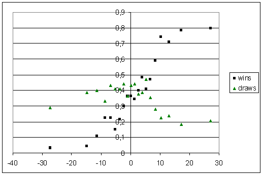
The fractions of wins does basically what we'd expect — it starts out flat and very low for teams that are outclassed, before rising steadily before plateauing. There are always going to be some draws (because of rain), so the fraction of wins won't hit zero or one. Even the weakest of home teams can achieve a draw rate of about 30% (well, maybe not Bangladesh), whereas very weak teams away can only draw about 20% of Tests.
The trend in draws is a bit different. It seems to go gently upwards until the teams are evenly matched, and then more sharply downwards as the home team becomes stronger.
I approximated these curves with piecewise linear functions. For the draws, it's flat for x less than -27, then upwards so that it hits the y-axis at y = 0,424, then downwards until x = 17, and then flat, at a value of 0,185.
For the wins, it's flat at 0,031 below x = -13,7, then upwards until x = 17,2, and then flat at a value of 0,785.
So now, for each Test, I calculate the difference in strength. Then I plug that number into the fitted graphs to get a fraction of a win, draw, and loss. For example, suppose that the teams are evenly matched. Then the home side gets 0,366 wins; 0,424 draws; 0,21 losses. The wins and losses for the away side are flipped: 0,21 wins and 0,366 losses.
You do this for each Test that a captain plays, and add up the expected wins, draws, and losses. Now we can compare to the actual record.
There's a question here about how to deal with draws. I decided to ignore them, for a couple of reasons. The first is that teams which score runs faster should have less draws, but I didn't take strike rate into account when doing the regressions above (I don't have strike rate data for all Test batsmen). Also, all Tests in Australia (as well as some elsewhere) were played to a finish between 1882/3 and World War II — no draws in a major cricketing country for over sixty years!
So instead I calculated the fraction of wins out of matches that ended in a result, that is: wins / (wins + losses). Do this for the actual value, divide by the expected value, and you get a ratio saying how much better or worse the captain's record is compared to what would be expected.
Whether or not it is reasonable to ascribe all the difference to the captain is certainly debatable, but it seems the best thing to do for now. Here are the best captains, as measured by this statistic. Qualification 20 Tests as captain.
Abdul Kardar, Pakistan's first Test captain, comes out on top. You can see that he didn't actually win many Tests, but his team managed to draw a lot that they "should" have lost. It is reassuring to see Mike Brearley so high up. Inzamam and Michael Vaughan are fifth and sixth.
Most of those high in the table did not have extended careers as captain, so perhaps some of them were just lucky and are higher than they should be. Of those with at least 50 Tests, Stephen Fleming is the best, just shading Viv Richards and Clive Lloyd.
At the other end, we have those who took their teams and un-inspired them to ineptitude:
Kim Hughes was pretty lucky to get to captain Australia in 28 Test matches.
A couple of others to finish (feel free to request others).
Mark Taylor 0,93, but probably disproportionately many of his losses were in dead rubbers. He also only had 11 draws (expected 17,5), in the era before Waugh made draws almost extinct for Australia.
Sunil Gavaskar 1,10 is the best Indian captain. He achieved this record by turning five expected wins into draws, and seven expected losses into draws. Not exciting stuff, but it gave him an overall positive record (9 wins, 30 draws, 8 losses).
Imran Khan at 1,08 didn't do that much better than he should have, and was also pretty drawish (14-26-8, expected 17,6-18,0-12,3). He did a bit better than Javed, who scores 0,99.
First, I'll explain how to get the expected results. This method is a bit rough and can certainly be improved in places, but overall I think it does a good job. For each team, I calculate the average batting average (averages weighted by the averages of the bowlers faced), and average bowling average (with wickets wickets weighted by the batting average of the batsman dismissed). The latter is a little bit tricky — some teams use more bowlers than others. So, for each innings, I weighted the bowling averages by the number of balls bowled by each bowler. Then, if two innings were bowled, I took the average of the two.
Then you subtract the average bowling average from the average batting average, and you get a rating for the team. Do the same for the other side, and you get a measure of the difference in strength between the two sides.
Next you go through all Tests, calculate the difference in strength (to make things consistent, I did home team rating minus away team rating), and find how many wins, draws, and losses there are at various differences in strengths. I did this by binning all Tests into 20 bins. Plotted on the graph below are the expected fraction of wins and draws.

The fractions of wins does basically what we'd expect — it starts out flat and very low for teams that are outclassed, before rising steadily before plateauing. There are always going to be some draws (because of rain), so the fraction of wins won't hit zero or one. Even the weakest of home teams can achieve a draw rate of about 30% (well, maybe not Bangladesh), whereas very weak teams away can only draw about 20% of Tests.
The trend in draws is a bit different. It seems to go gently upwards until the teams are evenly matched, and then more sharply downwards as the home team becomes stronger.
I approximated these curves with piecewise linear functions. For the draws, it's flat for x less than -27, then upwards so that it hits the y-axis at y = 0,424, then downwards until x = 17, and then flat, at a value of 0,185.
For the wins, it's flat at 0,031 below x = -13,7, then upwards until x = 17,2, and then flat at a value of 0,785.
So now, for each Test, I calculate the difference in strength. Then I plug that number into the fitted graphs to get a fraction of a win, draw, and loss. For example, suppose that the teams are evenly matched. Then the home side gets 0,366 wins; 0,424 draws; 0,21 losses. The wins and losses for the away side are flipped: 0,21 wins and 0,366 losses.
You do this for each Test that a captain plays, and add up the expected wins, draws, and losses. Now we can compare to the actual record.
There's a question here about how to deal with draws. I decided to ignore them, for a couple of reasons. The first is that teams which score runs faster should have less draws, but I didn't take strike rate into account when doing the regressions above (I don't have strike rate data for all Test batsmen). Also, all Tests in Australia (as well as some elsewhere) were played to a finish between 1882/3 and World War II — no draws in a major cricketing country for over sixty years!
So instead I calculated the fraction of wins out of matches that ended in a result, that is: wins / (wins + losses). Do this for the actual value, divide by the expected value, and you get a ratio saying how much better or worse the captain's record is compared to what would be expected.
Whether or not it is reasonable to ascribe all the difference to the captain is certainly debatable, but it seems the best thing to do for now. Here are the best captains, as measured by this statistic. Qualification 20 Tests as captain.
                    ----expected----  --actual--  exp   act
name            mat w     d     l     w   d   l   w%    w%    ratio
Abdul Kardar    23  5,1   7,1   10,8  6   11  6   0,32  0,50  1,56
GP Howarth      30  7,9   11,1  11,1  11  12  7   0,42  0,61  1,47
J Darling       21  5,8   7,8   7,4   7   10  4   0,44  0,64  1,44
JM Brearley     31  11,3  12,0  7,7   18  9   4   0,60  0,82  1,37
Inzamam-ul-Haq  33  6,8   11,9  14,3  10  10  13  0,32  0,43  1,35
MP Vaughan      41  15,0  14,5  11,5  21  11  9   0,57  0,70  1,24
RB Richardson   24  8,4   8,2   7,4   11  7   6   0,53  0,65  1,21
GA Gooch        34  8,1   12,6  13,3  10  12  12  0,38  0,45  1,20
CA Walsh        22  5,7   7,6   8,7   6   9   7   0,40  0,46  1,16
DG Bradman      24  11,7  7,7   4,6   15  6   3   0,72  0,83  1,16
SP Fleming      80  23,6  27,1  29,3  28  25  27  0,45  0,51  1,14
RB Simpson      39  10,9  14,2  13,9  12  15  12  0,44  0,50  1,14
IVA Richards    50  21,7  18,2  10,1  27  15  8   0,68  0,77  1,13
CH Lloyd        74  31,3  27,0  15,7  36  26  12  0,67  0,75  1,13
N Hussain       45  14,0  15,5  15,5  17  13  15  0,48  0,53  1,12
Abdul Kardar, Pakistan's first Test captain, comes out on top. You can see that he didn't actually win many Tests, but his team managed to draw a lot that they "should" have lost. It is reassuring to see Mike Brearley so high up. Inzamam and Michael Vaughan are fifth and sixth.
Most of those high in the table did not have extended careers as captain, so perhaps some of them were just lucky and are higher than they should be. Of those with at least 50 Tests, Stephen Fleming is the best, just shading Viv Richards and Clive Lloyd.
At the other end, we have those who took their teams and un-inspired them to ineptitude:
                    ----expected----  --actual--  exp   act
name            mat w     d     l     w   d   l   w%    w%    ratio
M Azharuddin    47  18,5  17,2  11,3  14  19  14  0,62  0,50  0,80
HH Streak       21  5,0   6,1   9,9   4   6   11  0,33  0,27  0,80
MW Gatting      23  5,1   8,9   9,1   2   16  5   0,36  0,29  0,79
CL Hooper       22  5,2   7,8   8,9   4   7   11  0,37  0,27  0,72
BS Bedi         22  7,0   7,8   7,2   6   5   11  0,49  0,35  0,72
DI Gower        32  7,0   12,0  13,0  5   9   18  0,35  0,22  0,62
JR Reid         34  5,3   11,1  17,6  3   13  18  0,23  0,14  0,62
AC MacLaren     22  6,6   7,9   7,5   4   7   11  0,47  0,27  0,57
KJ Hughes       28  7,3   10,3  10,4  4   11  13  0,41  0,24  0,57
A Flower        20  3,5   6,4   10,1  1   9   10  0,26  0,09  0,36
Kim Hughes was pretty lucky to get to captain Australia in 28 Test matches.
A couple of others to finish (feel free to request others).
Mark Taylor 0,93, but probably disproportionately many of his losses were in dead rubbers. He also only had 11 draws (expected 17,5), in the era before Waugh made draws almost extinct for Australia.
Sunil Gavaskar 1,10 is the best Indian captain. He achieved this record by turning five expected wins into draws, and seven expected losses into draws. Not exciting stuff, but it gave him an overall positive record (9 wins, 30 draws, 8 losses).
Imran Khan at 1,08 didn't do that much better than he should have, and was also pretty drawish (14-26-8, expected 17,6-18,0-12,3). He did a bit better than Javed, who scores 0,99.
Sunday, March 09, 2008
Wicket-keepers and byes
In my post on first-class wicket-keepers in England, I pointed out a curious trend — there were quite a lot of keepers from the 1980's near the top of the table of byes as a percentage of team runs. I guessed that it was because of the higher run rates during this time, compared with previous decades (and because of the trend afterwards to choose keepers based on their batting). Using byes per 600 balls gives more reasonable results, but it should still be biased by the prevailing run rate — if the run rate is higher, the batsmen are probably hitting more balls, so the keeper's bye rate should be lower.
Ideally, we'd have a stat for byes per balls that pass the batsman. But since we'd need ball-by-ball data to find this, we have to make do without. Yesterday I had an idea of how to adjust for run rates. I thought it was a good idea, but it didn't work. First, I'll explain what I wanted to do and how it should have worked.
You can't use bye rates and run rates and look for a correlation over all matches — the average standard of wicket-keeping can (and does) change with era. But the standard of an individual keeper should be fairly consistent over his career, and every keeper will keep in innings where the opposition scores heavily, and in innings where the scoring is slow. Since some keepers in England play many hundreds of matches, there should be enough data at an individual level to work out what the trend is.
So for each keeper, I took all innings kept and ordered them by the run rate (when calculating the run rate, I ignored byes). To avoid the problem of what to do with very short innings (and to make the graphs nicer), I aggregated the data into ten bins, and found the overall average number of byes per 600 balls for each bin. The result for Alan Knott is below.
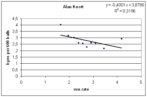
It's not perfect, but the overall trend is pretty clear — at higher run rates, Knotty gave away less byes.
That was the idea. It turns out that not all keepers have this trend. Here's Jack Russell:
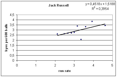
It's a nice trend, in the wrong direction.
Taking keepers who kept in at least 100 innings, there are actually more with positive slopes than negative. Some of this effect might be noise, so I did the same calculation but calculated the regression lines using only the middle eight bins (perhaps short innings come up disproportionately often in the first and last bins, and so the data's less reliable).
Then, I considered only keepers whose career began after World War II, and who kept in at least 300 innings. The result? Twenty-nine keepers with positive slope, twenty-eight with negative, one flat. The average slope for this set of keepers was 0,01.
There does appear to be a slight tendency towards negative slopes for those with very long careers (i.e., more than 725 innings), but that might just be noise, and it's still not a hard-and-fast rule — Bob Taylor kept in 976 innings, and has a slope of 0,235.
So that's a bit of a surprising dead end of a conclusion. Wicket-keepers don't generally give away less byes when the batsmen score runs faster.
Ideally, we'd have a stat for byes per balls that pass the batsman. But since we'd need ball-by-ball data to find this, we have to make do without. Yesterday I had an idea of how to adjust for run rates. I thought it was a good idea, but it didn't work. First, I'll explain what I wanted to do and how it should have worked.
You can't use bye rates and run rates and look for a correlation over all matches — the average standard of wicket-keeping can (and does) change with era. But the standard of an individual keeper should be fairly consistent over his career, and every keeper will keep in innings where the opposition scores heavily, and in innings where the scoring is slow. Since some keepers in England play many hundreds of matches, there should be enough data at an individual level to work out what the trend is.
So for each keeper, I took all innings kept and ordered them by the run rate (when calculating the run rate, I ignored byes). To avoid the problem of what to do with very short innings (and to make the graphs nicer), I aggregated the data into ten bins, and found the overall average number of byes per 600 balls for each bin. The result for Alan Knott is below.

It's not perfect, but the overall trend is pretty clear — at higher run rates, Knotty gave away less byes.
That was the idea. It turns out that not all keepers have this trend. Here's Jack Russell:

It's a nice trend, in the wrong direction.
Taking keepers who kept in at least 100 innings, there are actually more with positive slopes than negative. Some of this effect might be noise, so I did the same calculation but calculated the regression lines using only the middle eight bins (perhaps short innings come up disproportionately often in the first and last bins, and so the data's less reliable).
Then, I considered only keepers whose career began after World War II, and who kept in at least 300 innings. The result? Twenty-nine keepers with positive slope, twenty-eight with negative, one flat. The average slope for this set of keepers was 0,01.
There does appear to be a slight tendency towards negative slopes for those with very long careers (i.e., more than 725 innings), but that might just be noise, and it's still not a hard-and-fast rule — Bob Taylor kept in 976 innings, and has a slope of 0,235.
So that's a bit of a surprising dead end of a conclusion. Wicket-keepers don't generally give away less byes when the batsmen score runs faster.
Saturday, March 08, 2008
The meaningfulness of Tests and ODI's
Today I want to statistically show what is obvious and logical — that there's a lot more luck in ODI's than in Tests. But something not quite so obvious comes up later.
I got the idea for this sort of analysis from this post by Tangotiger, who usually studies baseball statistics. (In that post, he gives a method for finding the standard deviation of the talent distribution in a league. I think that he actually estimates a lower bound for this quantity.)
I took all Tests and all ODI's between the top eight nations since 2003. (I did this in Statsguru. I didn't realise it before, but in the advanced filter, if you click on the 'view' near the right edge of the table, you get checkboxes rather than a dropdown menu. Do this for Team and Opposition, check the major nations, and in eighteen clicks you've excluded Bangladesh, Zimbabwe, and all the weird teams.) I then threw away any draws, ties, or no-results, and calculated the fraction of wins for each team. (So, e.g., a team with five wins, five losses, and five draws will have a fraction of wins of 0,500 — not 0,333.)
Tests:
ODI's:
The gap in winning percentage between top and bottom is much larger in Tests than in ODI's, which is what we would expect — Tests better differentiate between the quality of the teams. The standard deviation of the win percentage for Tests is 0,219; that for ODI's is 0,119.
So far, nothing you wouldn't have guessed. But it's interesting to compare this to what you'd expect from chance. That is, if every match that ends in a result were decided by a coin toss, what standard deviation would you expect? The SD for the number of wins out of n games would be sqrt(n/4), from the binomial distribution. The variance, being the square of the SD, would be n/4. The fraction of wins is the number of wins divided by n. Now, Var(aX) = a²Var(X), so the variance in the fraction of wins would be 1/(4n). So the SD would be sqrt(1/(4n)).
If you take n as the average number (for each team) of result matches in each set (31,75 for Tests; 106,25 for ODI's), you get the SD's expected from chance as 0,088 for Tests and 0,049 for ODI's.
What you'd like in a distribution of winning percentages is that it's clearly wider than what you'd expect from chance (so that you can conclude that the differences between teams are due to differences in the quality of their play, not just the luck of the day). Since the SD you'd expect from chance for ODI's is smaller than that for Tests (because more ODI's are played), you actually don't need the real SD for ODI's to be as large as that for Tests, in order to sort the teams out.
A simple way to quantify this (there may be a better way) is to take the observed SD divided by the SD expected from chance. For Tests, this is 0,219/0,088 = 2,47. For ODI's, it's 0,119/0,049 = 2,46.
Almost exactly the same! That's probably a little bit lucky — those numbers would probably be a bit further apart if I'd picked a different period — but it shows that, in terms of sorting out which the ranking of the teams, the balance between Tests and ODI's is about right. There were, over this period, about 2,4 ODI's played between these teams for every Test.
That doesn't mean I like all these ODI's! Each one of them is, in itself, much more meaningless than a Test match (at least outside World Cups, and except for draws, which are happily a minority of Tests these days). And even though they take up fewer playing days in total than Tests, each match is independent of the others. A bad day for a team doesn't matter — the teams start from scratch again in two days' time. In a Test match, of course, a bad day directly affects the remainder of the match.
I got the idea for this sort of analysis from this post by Tangotiger, who usually studies baseball statistics. (In that post, he gives a method for finding the standard deviation of the talent distribution in a league. I think that he actually estimates a lower bound for this quantity.)
I took all Tests and all ODI's between the top eight nations since 2003. (I did this in Statsguru. I didn't realise it before, but in the advanced filter, if you click on the 'view' near the right edge of the table, you get checkboxes rather than a dropdown menu. Do this for Team and Opposition, check the major nations, and in eighteen clicks you've excluded Bangladesh, Zimbabwe, and all the weird teams.) I then threw away any draws, ties, or no-results, and calculated the fraction of wins for each team. (So, e.g., a team with five wins, five losses, and five draws will have a fraction of wins of 0,500 — not 0,333.)
Tests:
team         w   l   w%
Australia    35  7   0,833
England      25  16  0,610
South Africa 21  18  0,538
India        14  11  0,560
Pakistan     13  16  0,448
Sri Lanka    10  14  0,417
New Zealand  5   14  0,263
West Indies  4   31  0,114
ODI's:
Australia    93  34  0,732
India        61  69  0,469
South Africa 53  41  0,564
New Zealand  50  52  0,490
Pakistan     50  53  0,485
Sri Lanka    50  56  0,472
England      38  61  0,384
West Indies  30  59  0,337
The gap in winning percentage between top and bottom is much larger in Tests than in ODI's, which is what we would expect — Tests better differentiate between the quality of the teams. The standard deviation of the win percentage for Tests is 0,219; that for ODI's is 0,119.
So far, nothing you wouldn't have guessed. But it's interesting to compare this to what you'd expect from chance. That is, if every match that ends in a result were decided by a coin toss, what standard deviation would you expect? The SD for the number of wins out of n games would be sqrt(n/4), from the binomial distribution. The variance, being the square of the SD, would be n/4. The fraction of wins is the number of wins divided by n. Now, Var(aX) = a²Var(X), so the variance in the fraction of wins would be 1/(4n). So the SD would be sqrt(1/(4n)).
If you take n as the average number (for each team) of result matches in each set (31,75 for Tests; 106,25 for ODI's), you get the SD's expected from chance as 0,088 for Tests and 0,049 for ODI's.
What you'd like in a distribution of winning percentages is that it's clearly wider than what you'd expect from chance (so that you can conclude that the differences between teams are due to differences in the quality of their play, not just the luck of the day). Since the SD you'd expect from chance for ODI's is smaller than that for Tests (because more ODI's are played), you actually don't need the real SD for ODI's to be as large as that for Tests, in order to sort the teams out.
A simple way to quantify this (there may be a better way) is to take the observed SD divided by the SD expected from chance. For Tests, this is 0,219/0,088 = 2,47. For ODI's, it's 0,119/0,049 = 2,46.
Almost exactly the same! That's probably a little bit lucky — those numbers would probably be a bit further apart if I'd picked a different period — but it shows that, in terms of sorting out which the ranking of the teams, the balance between Tests and ODI's is about right. There were, over this period, about 2,4 ODI's played between these teams for every Test.
That doesn't mean I like all these ODI's! Each one of them is, in itself, much more meaningless than a Test match (at least outside World Cups, and except for draws, which are happily a minority of Tests these days). And even though they take up fewer playing days in total than Tests, each match is independent of the others. A bad day for a team doesn't matter — the teams start from scratch again in two days' time. In a Test match, of course, a bad day directly affects the remainder of the match.
Thursday, March 06, 2008
Left-handers
There are a handful of papers in academic journals that analyse cricket statistics. The methods used in these papers tend to be far more sophisticated than what I use (and usually I don't even understand them), but often the results are interesting and/or useful. Unfortunately, they tend to languish in academic journals, unknown by the average cricket fan. To try to remedy this, every now and then I'll have a look at one of these papers and discuss the methods and results.
The first paper I'll look at is by Robert Brooks et al. It's called Sinister strategies succeed at the cricket World Cup, and was published in the Proceedings of the Royal Society Series B (Biology Letters, Supplement) 271: S64. You can get a copy from the website of one of the authors here.
The authors studied the 2003 World Cup, in an attempt to see work out why left-handers are more prevalent in top-level cricket than in the general population. Cricket's not unique in this regard — most sports involving one-on-one contests have a higher proportion of left-handers. Individual sports (such as athletics or golf) do not.
My own feeling was that a large part of left-handed batsmen's success is because the stock ball of right-arm pacemen usually swings into them, and inswingers are easier to play than outswingers. But this paper by Brooks gives strong evidence to suggest that it's more a case of bowlers not being used to bowling to left-handers.
The paper draws out two effects. The first is that weaker countries have a lower proportion of left-handers. The suggested reason is that when the domestic competition is weak, natural talent is the biggest factor in getting selected for the national side — the variation in talent is large enough so that the left-handers' natural advantage is not important. But at a stronger level of competition, where there is less variation in players' ability, the extra advantage that left-handers have becomes more important, leading to disproportionately many of them in national teams. Their figure below shows the trend:
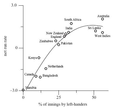
On the vertical axis is the team's net run rate (i.e., how good they are), and on the horizontal axis is the percentage of innings by left-handers. They've fitted a quadratic to the data, which gives a pretty good fit. The interesting feature is that the quadratic peaks at close to 50% left-handers, suggesting that the ideal batting line-up should have an equal number of left- and right-handers.
Now, the obvious explanation for this is that teams with equal numbers of right- and left-hand batsmen enjoy lots of opposite-handed partnerships, and it is an accepted piece of wisdom that bowlers struggle when having to change their line when the batsmen rotate the strike.
But this does not look to be a significant factor. The authors looked at each batsman when they were in partnership with someone of the same hand or with someone of the opposite hand, and found no significant difference. There's some mixed evidence on the usefulness of left-right partnerships. In The Best of the Best, Charles Davis says that left-right opening partnerships (in Tests) average about 15% more runs than would be expected based on the individual averages, whereas same-handed partnerships are about average. My own figures, based on a regression on opening batsmen's averages, puts left-right combinations at 6% better than they should be, and same-handed partnerships 4% worse. But there is plenty of individual variation. It does certainly look like there's a real effect, but you need a large dataset to see it — much larger than just one World Cup — and this is why the authors of the paper didn't find anything significant.
Nevertheless, if there is an advantage to having 50% of the team left-handed, and left-right partnerships are not significant or small, then there has to be something else. The authors show us the following graph.
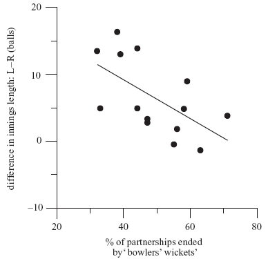
On the horizontal axis is the percentage of "bowlers' wickets" for each team, and on the vertical axis is the difference between balls faced by left-handers and right-handers by the batting team. Bowlers' wickets are defined as catches from edges, LBW's, and bowleds. They had to do a lot of trawling through Cricinfo's commentary archives to find catches that were at slip!
The trend here is pretty obvious. When there are more bowlers' wickets (suggesting stronger bowling attacks... or really bad fieldsmen), left-handers don't enjoy as much of an advantage over right-handers. The explanation offered by the authors is that weaker bowlers tend to come from weaker competitions, where there are not so many left-handed batsmen. So these bowlers aren't as used to bowling to left-handers so much.
This gives us a reason for the optimum of 50% left-handers. Any more than 50%, and the bowlers would be so used to lefties than right-handers would start to have an advantage.
So it looks like most of the left-handers advantage comes down to bowlers not being used to bowling at them. But the overall story is certainly more complicated. In The Best of the Best, Davis shows that players who bowl right and bat left do better, on average, than players who bowl left and bat left. Is this because the top hand is more important, so that's where you want your dominant hand? Who knows? Players who bowl left and bat right do worse than players who bowl right and bat right. I don't understand.
The first paper I'll look at is by Robert Brooks et al. It's called Sinister strategies succeed at the cricket World Cup, and was published in the Proceedings of the Royal Society Series B (Biology Letters, Supplement) 271: S64. You can get a copy from the website of one of the authors here.
The authors studied the 2003 World Cup, in an attempt to see work out why left-handers are more prevalent in top-level cricket than in the general population. Cricket's not unique in this regard — most sports involving one-on-one contests have a higher proportion of left-handers. Individual sports (such as athletics or golf) do not.
My own feeling was that a large part of left-handed batsmen's success is because the stock ball of right-arm pacemen usually swings into them, and inswingers are easier to play than outswingers. But this paper by Brooks gives strong evidence to suggest that it's more a case of bowlers not being used to bowling to left-handers.
The paper draws out two effects. The first is that weaker countries have a lower proportion of left-handers. The suggested reason is that when the domestic competition is weak, natural talent is the biggest factor in getting selected for the national side — the variation in talent is large enough so that the left-handers' natural advantage is not important. But at a stronger level of competition, where there is less variation in players' ability, the extra advantage that left-handers have becomes more important, leading to disproportionately many of them in national teams. Their figure below shows the trend:

On the vertical axis is the team's net run rate (i.e., how good they are), and on the horizontal axis is the percentage of innings by left-handers. They've fitted a quadratic to the data, which gives a pretty good fit. The interesting feature is that the quadratic peaks at close to 50% left-handers, suggesting that the ideal batting line-up should have an equal number of left- and right-handers.
Now, the obvious explanation for this is that teams with equal numbers of right- and left-hand batsmen enjoy lots of opposite-handed partnerships, and it is an accepted piece of wisdom that bowlers struggle when having to change their line when the batsmen rotate the strike.
But this does not look to be a significant factor. The authors looked at each batsman when they were in partnership with someone of the same hand or with someone of the opposite hand, and found no significant difference. There's some mixed evidence on the usefulness of left-right partnerships. In The Best of the Best, Charles Davis says that left-right opening partnerships (in Tests) average about 15% more runs than would be expected based on the individual averages, whereas same-handed partnerships are about average. My own figures, based on a regression on opening batsmen's averages, puts left-right combinations at 6% better than they should be, and same-handed partnerships 4% worse. But there is plenty of individual variation. It does certainly look like there's a real effect, but you need a large dataset to see it — much larger than just one World Cup — and this is why the authors of the paper didn't find anything significant.
Nevertheless, if there is an advantage to having 50% of the team left-handed, and left-right partnerships are not significant or small, then there has to be something else. The authors show us the following graph.

On the horizontal axis is the percentage of "bowlers' wickets" for each team, and on the vertical axis is the difference between balls faced by left-handers and right-handers by the batting team. Bowlers' wickets are defined as catches from edges, LBW's, and bowleds. They had to do a lot of trawling through Cricinfo's commentary archives to find catches that were at slip!
The trend here is pretty obvious. When there are more bowlers' wickets (suggesting stronger bowling attacks... or really bad fieldsmen), left-handers don't enjoy as much of an advantage over right-handers. The explanation offered by the authors is that weaker bowlers tend to come from weaker competitions, where there are not so many left-handed batsmen. So these bowlers aren't as used to bowling to left-handers so much.
This gives us a reason for the optimum of 50% left-handers. Any more than 50%, and the bowlers would be so used to lefties than right-handers would start to have an advantage.
So it looks like most of the left-handers advantage comes down to bowlers not being used to bowling at them. But the overall story is certainly more complicated. In The Best of the Best, Davis shows that players who bowl right and bat left do better, on average, than players who bowl left and bat left. Is this because the top hand is more important, so that's where you want your dominant hand? Who knows? Players who bowl left and bat right do worse than players who bowl right and bat right. I don't understand.
Sunday, March 02, 2008
Partly explaining all these double-centuries
It's pretty obvious that there are a lot more double-centuries being scored these days than in previous eras. This isn't just because there are more Tests being played now than ever before: Charles Davis calculated the percentage of centuries converted into double-centuries in early 2005 (search for the "Double the fun for Ponting" post). Whereas this was between 7 and 8 percent from the 1960's through to the 1990's, it jumped to 11.4% from 2000 to 2005. That is, more than one in ten centuries were turned into doubles.
Davis said that the overall batting average had rised a little bit, but not enough to account for this rise. He suggested that while bowlers overall were a little bit weaker now, they're particularly weak when a batsman gets well set — "once bowling attacks are beaten down, there is less capacity for comeback."
The key question here is, if the overall batting average rises by some amount, how much should the proportion of centuries-that-are-doubles rise?
The answer to that question depends on the distribution of individual scores. Let's assume that the distribution is exponential. It's not, but if we compare decades, hopefully the errors will roughly cancel out, giving us a meaningful comparison.
If the overall average is µ, then the fraction of scores greater than or equal to 200 is exp(-200/µ). The fraction of scores greater than or equal to 100 is exp(-100/µ). So the fraction of centuries turned into doubles is exp(-200/µ)/exp(-100/µ) = exp(-100/µ). Note that this is just the fraction of centuries — this is the memoryless property of the exponential distribution.
Then we take µ1 for the 1990's, and µ2 for the 2000's, and use these to find the expected fraction of centuries that are doubles.
I considered only batsmen in positions 1 to 7, since that's where most centuries come from. The overall average for these batsmen in the 1990's was 35.35, and for the 2000's it was 38.04.
Plug these numbers in, and you expect 5.9% for the 1990's, and 7.2% for the 2000's. Now, we expect that these values will be wrong (and they are) because the distribution isn't really exponential. But dividing one by the other should mostly cancel this out, and so we expect that the proportion of centuries turned into double should rise by a factor of 1.22. A less than 10% rise in batting average leads to a greater than 20% rise in centuries turned into doubles.
The proportion for the 1990's was 7.6% (I lumped not-outs and outs together; Davis says 7.9%). For the 2000's it's 10.5%. The proportion increased by a factor of 1.38. Just based on the averages, you'd have expected it to rise to 9.3%. The difference here is about 9 centuries over the course of the decade to date, or about one extra double-century per calendar year.
That sounds like something you can blame on the minnows, but that's not the case. If you re-do the analysis excluding Bangladesh and Zimbabwe, then the figures become expected 1.24 and observed 1.39.
So there does appear to be a real effect, but it's not that great. The general rise in batting averages is most important factor, but there is this extra double-century a year that "shouldn't" happen.
There's no point stopping here. What's special about 200? I did a similar above analysis for Tests from the 1950's onwards. Then, grouping by decade, I found the fraction of scores greater than or equal to 1, greater than or equal to 2, etc. up to 240. For a reference case, I also did this for all Tests during this period.
Then for each decade, I calculated the observed increase or decrease of the fraction of each score from the reference case (as a factor, e.g., 6% to 9%, an increase by a factor of 1.5), and the expected increase or decrease based on the decade average against the reference average (e.g., 5% to 7%, an increase by a factor of 1.4).
Take the observed increase minus the expected increase (1.5 - 1.4 = 0.1), and you get a measure of how common scores greater than or equal to the given score are, against what they "should" be. A positive value tells you that scores greater than or equal to the given score are more common than you would expect, based on the decade average.
It's graph time.
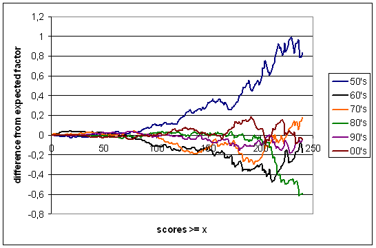
I hope you can make out the different colours. The most striking feature of the graph is the curve for the 1950's. Despite the overall average being much lower (only 32.43), there were a comparable fraction of large scores to what we see today, when the overall average is 38!
The curve for the 1960's is kind of a damped mirror image of the previous decade — less centuries than you would expect. The curve does start to come back up after 200, but I'd be sceptical about reading too much into the curves much past 200, since those scores are pretty rare and statistical noise becomes more prevalent.
The 1970's is similar to the 1960's, though it was closer to the expected.
The 1980's are almost dead on expected all the way up to 200.
The 1990's are a bit below expected for large scores.
The 2000's are a bit above expected, particularly above about 175. There's an amusing dip just past 200: the number of scores greater than or equal to 204 is almost exactly as expected.
So there you go. We have more double-centuries than we should (not by much), but a bigger phenomenon is the number of scores greater than 175. I blame Michael Vaughan.
Davis said that the overall batting average had rised a little bit, but not enough to account for this rise. He suggested that while bowlers overall were a little bit weaker now, they're particularly weak when a batsman gets well set — "once bowling attacks are beaten down, there is less capacity for comeback."
The key question here is, if the overall batting average rises by some amount, how much should the proportion of centuries-that-are-doubles rise?
The answer to that question depends on the distribution of individual scores. Let's assume that the distribution is exponential. It's not, but if we compare decades, hopefully the errors will roughly cancel out, giving us a meaningful comparison.
If the overall average is µ, then the fraction of scores greater than or equal to 200 is exp(-200/µ). The fraction of scores greater than or equal to 100 is exp(-100/µ). So the fraction of centuries turned into doubles is exp(-200/µ)/exp(-100/µ) = exp(-100/µ). Note that this is just the fraction of centuries — this is the memoryless property of the exponential distribution.
Then we take µ1 for the 1990's, and µ2 for the 2000's, and use these to find the expected fraction of centuries that are doubles.
I considered only batsmen in positions 1 to 7, since that's where most centuries come from. The overall average for these batsmen in the 1990's was 35.35, and for the 2000's it was 38.04.
Plug these numbers in, and you expect 5.9% for the 1990's, and 7.2% for the 2000's. Now, we expect that these values will be wrong (and they are) because the distribution isn't really exponential. But dividing one by the other should mostly cancel this out, and so we expect that the proportion of centuries turned into double should rise by a factor of 1.22. A less than 10% rise in batting average leads to a greater than 20% rise in centuries turned into doubles.
The proportion for the 1990's was 7.6% (I lumped not-outs and outs together; Davis says 7.9%). For the 2000's it's 10.5%. The proportion increased by a factor of 1.38. Just based on the averages, you'd have expected it to rise to 9.3%. The difference here is about 9 centuries over the course of the decade to date, or about one extra double-century per calendar year.
That sounds like something you can blame on the minnows, but that's not the case. If you re-do the analysis excluding Bangladesh and Zimbabwe, then the figures become expected 1.24 and observed 1.39.
So there does appear to be a real effect, but it's not that great. The general rise in batting averages is most important factor, but there is this extra double-century a year that "shouldn't" happen.
There's no point stopping here. What's special about 200? I did a similar above analysis for Tests from the 1950's onwards. Then, grouping by decade, I found the fraction of scores greater than or equal to 1, greater than or equal to 2, etc. up to 240. For a reference case, I also did this for all Tests during this period.
Then for each decade, I calculated the observed increase or decrease of the fraction of each score from the reference case (as a factor, e.g., 6% to 9%, an increase by a factor of 1.5), and the expected increase or decrease based on the decade average against the reference average (e.g., 5% to 7%, an increase by a factor of 1.4).
Take the observed increase minus the expected increase (1.5 - 1.4 = 0.1), and you get a measure of how common scores greater than or equal to the given score are, against what they "should" be. A positive value tells you that scores greater than or equal to the given score are more common than you would expect, based on the decade average.
It's graph time.

I hope you can make out the different colours. The most striking feature of the graph is the curve for the 1950's. Despite the overall average being much lower (only 32.43), there were a comparable fraction of large scores to what we see today, when the overall average is 38!
The curve for the 1960's is kind of a damped mirror image of the previous decade — less centuries than you would expect. The curve does start to come back up after 200, but I'd be sceptical about reading too much into the curves much past 200, since those scores are pretty rare and statistical noise becomes more prevalent.
The 1970's is similar to the 1960's, though it was closer to the expected.
The 1980's are almost dead on expected all the way up to 200.
The 1990's are a bit below expected for large scores.
The 2000's are a bit above expected, particularly above about 175. There's an amusing dip just past 200: the number of scores greater than or equal to 204 is almost exactly as expected.
So there you go. We have more double-centuries than we should (not by much), but a bigger phenomenon is the number of scores greater than 175. I blame Michael Vaughan.
Subscribe to Comments [Atom]