Thursday, February 14, 2008
Bowler support
One of the problems in comparing bowlers from different teams is that they often have different levels of support. This is a recurring theme in Murali v Warne debates (in between expletive-laden rages) — Murali took more wickets per Test, but that was because Warne followed McGrath and Gillespie, and Murali only ever had Vaas. Warne had it easier, and that makes Murali's low average more remarkable. But maybe the batsmen didn't try to score as much against Murali, because they could pick off runs easily at the other end.
The debate can go on and on, and it's not clear which factors are the most important. So I asked myself the question, if you swapped the two bowlers between the two teams, what would their records be?
You can't answer this question perfectly, of course, but you can try. For each innings in which the bowler bowled, I defined the support average as the mean of the averages of the four bowlers who bowled the most overs in that innings (three bowlers if the bowler himself would have been one of the four). Note that, unless otherwise stated, the averages used are averages in which each wicket is weighted in proportion to the batting average of the batsman dismissed. I use end-of-career averages (to make my life easier and the numerics more stable).
I'll give an example of what I mean by the support average. Suppose that in one particular innings, the bowlers used were:
bowler (bowler's average): # of overs
A (25): 30
B (24): 34
C (33): 23
D (31): 15
E (45): 6
The support average of bowler A is (24 + 33 + 31)/3 = 29,33. The support average of bowler E is (25 + 24 + 33 + 31)/4 = 28,25.
To do the analysis, for each bowler I took all innings and sorted them by support average. I then binned them into quartiles (to reduce the noise and make for easier interpretation), that is, the quarter of innings with the lowest support averages, the quarter with the next lowest support averages, and so on.
Then for each quartile I calculated the bowler's average, and also the average support average, with the latter weighted by the number of balls bowled in each innings (so that, for instance, an innings where the bowler only bowled one over would barely be counted).
Then you can make tables like these ones:
You can see that Murali's support average is indeed much higher than Warne's, as you would expect. I don't know how much I want to read into individual trends — four data points, even aggregated ones, aren't a lot. That won't stop me trying. The overall trend for Warne is for his average to increase as his support gets weaker. In particular, for the upper quartile (the only one near where Murali has to bowl) his average is the highest, getting close to 30. Murali seems to turn it on when he has no-one to support him at all.
How about another pair, this time from the 1980's?
When Marshall didn't have Croft, Garner, Roberts, and/or Holding around him, he was still awesome.
And since I've apparently made comparing pairs of bowlers a theme for this post, here are the rather surprising results for McGrath and Gillespie:
It seems that Gillespie did actually do pretty well when McGrath wasn't around, and it was McGrath who got worse (a little bit) when he didn't have support. Well, perhaps — it could just be an artifact of McGrath's career trajectory, I haven't checked.
These are all well and good, but we'd like to do a bit more serious analysis with them. If you fit a regression line to an individual player, you can get a rough guide of how their average will change when the support gets better or worse. While it might be dubious to do this for just one player, if you do it for all players, the noise should largely cancel out and we'll be left with some solid numbers.
So, I took all bowlers with 100 Test wickest at at least 3 wickets per Test, calculated the slope of the regression line for each, and then took the mean of the slopes. The result was 0,50. That's a pretty hefty figure. It means that, on average, if the support average goes down by a run, then the bowler's average will go down by half a run. But it's inflated by the presence of some outliers. If you exclude players with less than 50 Tests (remember that we're dealing with quartiles here, so you need a large number of Tests to get reasonable quartile results), that figure drops to 0,25. So if the support average drops by four runs, the bowler's average drops by one run, on average.
You might be wondering if there's a correlation between average and the regression slope. There isn't. The scatterplot is equal parts scatter and plot.
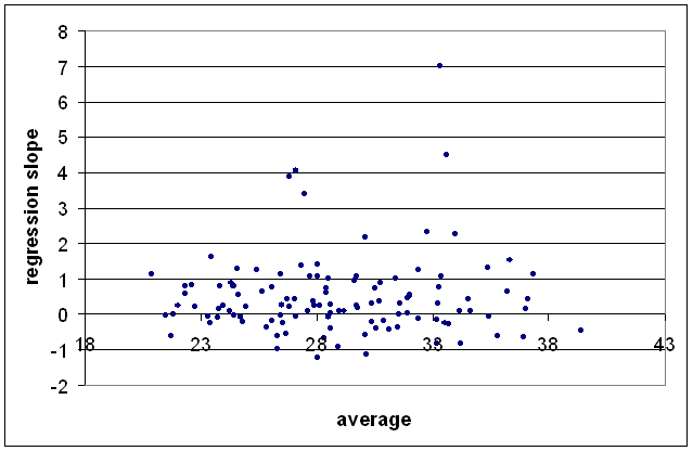
No trend emerges if you make the qualification 50 Tests to get rid of the outliers. I tried a few other variables, but I couldn't find anything with an R-squared of better than about 0,004. Even in cricket terms, none of them explained more than 7% of the data.
The debate can go on and on, and it's not clear which factors are the most important. So I asked myself the question, if you swapped the two bowlers between the two teams, what would their records be?
You can't answer this question perfectly, of course, but you can try. For each innings in which the bowler bowled, I defined the support average as the mean of the averages of the four bowlers who bowled the most overs in that innings (three bowlers if the bowler himself would have been one of the four). Note that, unless otherwise stated, the averages used are averages in which each wicket is weighted in proportion to the batting average of the batsman dismissed. I use end-of-career averages (to make my life easier and the numerics more stable).
I'll give an example of what I mean by the support average. Suppose that in one particular innings, the bowlers used were:
bowler (bowler's average): # of overs
A (25): 30
B (24): 34
C (33): 23
D (31): 15
E (45): 6
The support average of bowler A is (24 + 33 + 31)/3 = 29,33. The support average of bowler E is (25 + 24 + 33 + 31)/4 = 28,25.
To do the analysis, for each bowler I took all innings and sorted them by support average. I then binned them into quartiles (to reduce the noise and make for easier interpretation), that is, the quarter of innings with the lowest support averages, the quarter with the next lowest support averages, and so on.
Then for each quartile I calculated the bowler's average, and also the average support average, with the latter weighted by the number of balls bowled in each innings (so that, for instance, an innings where the bowler only bowled one over would barely be counted).
Then you can make tables like these ones:
SK Warne      q1     q2     q3     q4     overall
supp avg      26,32  27,81  29,61  35,24  29,92
bowl avg      26,58  29,01  26,59  29,52  27,91

M Muralidaran q1     q2     q3     q4     overall
supp avg      33,86  37,19  39,26  47,28  39,45
bowl avg      23,01  24,26  27,98  23,15  24,43
You can see that Murali's support average is indeed much higher than Warne's, as you would expect. I don't know how much I want to read into individual trends — four data points, even aggregated ones, aren't a lot. That won't stop me trying. The overall trend for Warne is for his average to increase as his support gets weaker. In particular, for the upper quartile (the only one near where Murali has to bowl) his average is the highest, getting close to 30. Murali seems to turn it on when he has no-one to support him at all.
How about another pair, this time from the 1980's?
RJ Hadlee     q1     q2     q3     q4     overall
supp avg      34,51  36,63  38,49  45,75  38,81
bowl avg      24,80  19,69  26,15  25,80  23,96

MD Marshall   q1     q2     q3     q4     overall
supp avg      24,96  27,13  30,01  36,55  29,73
bowl avg      25,01  19,29  20,75  23,22  21,83
When Marshall didn't have Croft, Garner, Roberts, and/or Holding around him, he was still awesome.
And since I've apparently made comparing pairs of bowlers a theme for this post, here are the rather surprising results for McGrath and Gillespie:
GD McGrath    q1     q2     q3     q4     overall
supp avg      28,02  29,32  30,61  33,38  30,28
bowl avg      22,19  20,41  21,92  25,78  22,36

JN Gillespie  q1     q2     q3     q4     overall
supp avg      26,47  27,43  28,49  34,30  29,28
bowl avg      32,81  28,75  30,62  22,23  28,05
It seems that Gillespie did actually do pretty well when McGrath wasn't around, and it was McGrath who got worse (a little bit) when he didn't have support. Well, perhaps — it could just be an artifact of McGrath's career trajectory, I haven't checked.
These are all well and good, but we'd like to do a bit more serious analysis with them. If you fit a regression line to an individual player, you can get a rough guide of how their average will change when the support gets better or worse. While it might be dubious to do this for just one player, if you do it for all players, the noise should largely cancel out and we'll be left with some solid numbers.
So, I took all bowlers with 100 Test wickest at at least 3 wickets per Test, calculated the slope of the regression line for each, and then took the mean of the slopes. The result was 0,50. That's a pretty hefty figure. It means that, on average, if the support average goes down by a run, then the bowler's average will go down by half a run. But it's inflated by the presence of some outliers. If you exclude players with less than 50 Tests (remember that we're dealing with quartiles here, so you need a large number of Tests to get reasonable quartile results), that figure drops to 0,25. So if the support average drops by four runs, the bowler's average drops by one run, on average.
You might be wondering if there's a correlation between average and the regression slope. There isn't. The scatterplot is equal parts scatter and plot.
No trend emerges if you make the qualification 50 Tests to get rid of the outliers. I tried a few other variables, but I couldn't find anything with an R-squared of better than about 0,004. Even in cricket terms, none of them explained more than 7% of the data.
# posted by David Barry : 22:45

![]()
Subscribe to Posts [Atom]