Sunday, July 27, 2008
It Figures
I have joined Cricinfo's stats blog It Figures. My first post there is a more sophisticated version of the IPL bowling analysis that I did earlier.
I should be posting to It Figures once a week, which is the rate I've been posting here. I'm not sure what will happen to this Blogspot blog. Perhaps only analyses that are too technical or too minor for Cricinfo. Boring and complicated — that'll bring in the visitors. We'll see how it goes.
I should be posting to It Figures once a week, which is the rate I've been posting here. I'm not sure what will happen to this Blogspot blog. Perhaps only analyses that are too technical or too minor for Cricinfo. Boring and complicated — that'll bring in the visitors. We'll see how it goes.
Bowleds, LBW's, and a little quiz
Whenever people study umpiring bias, they almost always look at LBW's. There's not a lot else you can do from looking at scorecards — other dismissal types are much more clear-cut.
A paper by Trevor Ringrose in 2006 ('Neutral umpires and leg before wicket decisions in test cricket', J. R. Stat. Soc. A 169, 903) considered LBW rates by country and the presence of neutral umpires, and found that the neutral umpires made no difference to the home-side bias of LBW decisions that affects some sides.
That paper's too technical for me to be bothered wading through this evening, so instead I'll talk about what Charles Davis did in The Best of the Best. For each team X, he calculated the difference between X's LBW percentage (that is, number of LBW's divided by number of wickets) and their opponent's LBW percentage, first for X's home Tests, then for X's away Tests. Find the difference of those two values and you get the home-side bias in LBW decisions for team X.
Pakistan is the major side that apparently gets favoured the most by home umpiring, clearly ahead of Australia. But Davis points out that in addition to having lots of LBW's go their way, Pakistani bowlers (I'm sure we know which ones) in the 1990's also got a very high number of bowled wickets. Correcting for this, the apparent umpiring bias in Pakistan becomes comparable to that in other countries. It just seems worse because they hit the pads so often.
So, following thinking along these lines, I took all bowlers with at least 100 Test wickets since World War II and plotted their LBW to caught ratio (i.e., number of LBW's divided by number of wickets caught) against bowled to LBW ratio. There's no fancy regressions to the mean or anything, these are raw numbers.
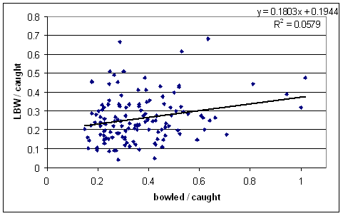
There's a bit of a trend there, but plenty of scatter. Ian Johnson (109 wickets) has one of the highest bowled to caught ratios (just over 0.7) but an LBW to caught of less than 0.2.
The two W's are fairly easy to spot — they're the ones fairly close together with LBW to caught ratios above 0.6, and bowled to caught ratios above 0.5. So they indeed got plenty of bowled and plenty of LBW's. But there are several bowlers with lots of LBW's and not many bowleds.
Now for that little quiz. Waqar has the highest LBW to caught ratio at 0.68. Wasim is third at 0.62. Who's second? He's the other data point quite high on that scatterplot, with a bowled to caught of 0.29.
A paper by Trevor Ringrose in 2006 ('Neutral umpires and leg before wicket decisions in test cricket', J. R. Stat. Soc. A 169, 903) considered LBW rates by country and the presence of neutral umpires, and found that the neutral umpires made no difference to the home-side bias of LBW decisions that affects some sides.
That paper's too technical for me to be bothered wading through this evening, so instead I'll talk about what Charles Davis did in The Best of the Best. For each team X, he calculated the difference between X's LBW percentage (that is, number of LBW's divided by number of wickets) and their opponent's LBW percentage, first for X's home Tests, then for X's away Tests. Find the difference of those two values and you get the home-side bias in LBW decisions for team X.
Pakistan is the major side that apparently gets favoured the most by home umpiring, clearly ahead of Australia. But Davis points out that in addition to having lots of LBW's go their way, Pakistani bowlers (I'm sure we know which ones) in the 1990's also got a very high number of bowled wickets. Correcting for this, the apparent umpiring bias in Pakistan becomes comparable to that in other countries. It just seems worse because they hit the pads so often.
So, following thinking along these lines, I took all bowlers with at least 100 Test wickets since World War II and plotted their LBW to caught ratio (i.e., number of LBW's divided by number of wickets caught) against bowled to LBW ratio. There's no fancy regressions to the mean or anything, these are raw numbers.

There's a bit of a trend there, but plenty of scatter. Ian Johnson (109 wickets) has one of the highest bowled to caught ratios (just over 0.7) but an LBW to caught of less than 0.2.
The two W's are fairly easy to spot — they're the ones fairly close together with LBW to caught ratios above 0.6, and bowled to caught ratios above 0.5. So they indeed got plenty of bowled and plenty of LBW's. But there are several bowlers with lots of LBW's and not many bowleds.
Now for that little quiz. Waqar has the highest LBW to caught ratio at 0.68. Wasim is third at 0.62. Who's second? He's the other data point quite high on that scatterplot, with a bowled to caught of 0.29.
Sunday, July 20, 2008
Wickets broken down by ball in the over
Quick one today, I've been busy for reasons that will become clear in a couple of days.
Here's the breakdown of wickets by ball in the over, in Tests since 1998 or so.
1: 2448
2: 2443
3: 2537
4: 2464
5: 2639
6: 2413
Ball five is about 3.3 standard deviations above the mean, which is interesting and significant at p=0.003. (Usually 3.3 standard deviations would correspond to p=0.0005, but there are six tests going on, which increases the likelihood that one of them will turn out significant. So I multiplied that 0.0005 by 6, which I hope is the correct thing to do.) I can't think of any obvious reason why the fifth ball in the over is relatively wicket-prone, so I'm leaning towards it just being a blip. Perhaps those stalemates in which the top-order batsman bats with the tail-ender and holds the strike for the first four balls? I don't know.
Now for the IPL:
1: 122
2: 131
3: 104
4: 104
5: 104
6: 124
The numbers are pretty small, but it's something to think about for when I gather more T20 data. Perhaps batsmen take a couple of balls to get their eye in against new bowlers. In Test cricket, these bowler changes happen less frequently, and also the batsmen are more watchful. In T20, they might be slogging from ball one. Just a thought, nothing concrete.
Saturday, July 12, 2008
Michael Vaughan looks funny when he gets bowled, but that is all.
(Edit: I just fixed a problem with the regression to the mean. No major changes to the batsmen that made the extremes of the tables, but the regressed estimates of bowled proportions are now much more accurate.
Edit: I should say that the methods used in this post have been either inspired by or directly copied from the baseballers, particularly from the authors of The Book - see their blog here.)
Some people in comments here (starting with MacMillings) have been discussing Michael Vaughan getting out bowled a lot. I was asked to have a look at it.
Charles Davis, in The Best of the Best, produced a graph similar to this one:
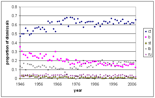
That's a plot showing the proportion of various dismissal types over time, looking only at batsmen from 1 to 6 in the order. Though I've started that graph at the end of World War II, the decline in bowled dismissals has been going on since the start of Test cricket. Why that should be so is a bit of a mystery. The slack's been taken up by catches and (sometimes) LBW's, the latter being influenced somewhat by changes in the Laws.
It's not entirely accounted for by keepers standing back and taking more catches &mdashes; though more and more wickets are coming from catches to the keeper, adding them to the bowleds still gives a clear decreasing trend.
So, rather than wondering where Michael Vaughan stands in relation to batsmen from history in terms of getting bowled, we'll consider only batsmen from 1990. The trend in bowleds from 1990 to the present is close enough to flat.
The next thing to think about is whether or not differences in bowled proportions for batsmen is an inherent characteristic of the various batting styles, or simply due to random chance.
I took all batsmen with at least 50 dismissals since 1990, and an adjusted average of at least 35. Across all these wickets, about 15% were bowled. Now, any wicket is either bowled or something else. If this is random, then the proportion of bowleds for a batsman will follow a binomial distribution, with mean 0.15 and standard deviation sqrt(0.15*(1-0.15)/outs). Here and below, 'outs' is the number of times a batsman is dismissed.
Plugging those numbers in to get z-scores for each of the batsmen in the dataset (59 of them), we find 6 with a z-score more than 2 standard deviations from the mean (from random chance, you'd expect about 3), and 27 more than 1 standard deviation from the mean (you'd expect about 19). The standard deviation of the z-scores is about 1.2 instead of 1.
Now, the observed variance comes from two terms — random luck, and the inherent 'true' differences between the players. Since luck is independent of the actual differences, we have that var(observed) = var(true) + var(luck). The observed variance is about 0.042; the variance due to luck is roughly 0.15*0.85/120 = 0.0332 (the denominator 120 being the average number of outs across the batsman in the dataset). The var(true) is the difference, and so the standard deviation of the inherent differences is sqrt(0.042 - 0.0332) = 0.025.
So, there are genuine differences between batsmen in terms of how often they get out bowled, and it's sensible to start comparing them. But before I start doing so, we should regress each player's observed bowled proportion to the mean. We have an estimate of the player's bowled proportion as p +/- sqrt(p*(1-p)/outs), and the player's coming from a distribution that goes like 0.15 +/- 0.025. The estimate of the batsman's 'true' bowled proportion is calculated using the same formula as given here.
First, does a high proportion of bowled dismissals make a bad batsman?
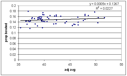
There's no trend at all amongst good batsmen. Tail-enders (not shown on the graph) do get out bowled more often though.
Now for the batsmen who get out bowled the most and the least since 1990. The 'b' column is the number of bowled dismissals. The last two columns are the observed proportion of bowleds and that figure regressed to the mean.
I wouldn't have picked Border to be near the top. Though he was on the decline in his last few years (which is all the above table considers), his high bowled proportion was a feature throughout his career.
Where's Michael Vaughan? At an observed proportion of 0.157 (now 0.164 after his latest dismissal), regressed to 0.153. Just above above the mean, nothing special or unusual at all.
His technique does lend itself to jokes though.
Lastly, there was some talk about whether or not bowleds are more common at lower scores. Since 1990, dismissal proportions by score, amongst top six batsmen:
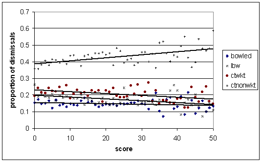
The regression lines from top to bottom are caught by non-keepers, caught by keeper, LBW, bowled.
Bowleds in fact stay pretty steady. Catches at the wicket and LBW's decline, and catches to non-keepers become steadily more prevalent as the innings goes on.
Edit: I should say that the methods used in this post have been either inspired by or directly copied from the baseballers, particularly from the authors of The Book - see their blog here.)
Some people in comments here (starting with MacMillings) have been discussing Michael Vaughan getting out bowled a lot. I was asked to have a look at it.
Charles Davis, in The Best of the Best, produced a graph similar to this one:

That's a plot showing the proportion of various dismissal types over time, looking only at batsmen from 1 to 6 in the order. Though I've started that graph at the end of World War II, the decline in bowled dismissals has been going on since the start of Test cricket. Why that should be so is a bit of a mystery. The slack's been taken up by catches and (sometimes) LBW's, the latter being influenced somewhat by changes in the Laws.
It's not entirely accounted for by keepers standing back and taking more catches &mdashes; though more and more wickets are coming from catches to the keeper, adding them to the bowleds still gives a clear decreasing trend.
So, rather than wondering where Michael Vaughan stands in relation to batsmen from history in terms of getting bowled, we'll consider only batsmen from 1990. The trend in bowleds from 1990 to the present is close enough to flat.
The next thing to think about is whether or not differences in bowled proportions for batsmen is an inherent characteristic of the various batting styles, or simply due to random chance.
I took all batsmen with at least 50 dismissals since 1990, and an adjusted average of at least 35. Across all these wickets, about 15% were bowled. Now, any wicket is either bowled or something else. If this is random, then the proportion of bowleds for a batsman will follow a binomial distribution, with mean 0.15 and standard deviation sqrt(0.15*(1-0.15)/outs). Here and below, 'outs' is the number of times a batsman is dismissed.
Plugging those numbers in to get z-scores for each of the batsmen in the dataset (59 of them), we find 6 with a z-score more than 2 standard deviations from the mean (from random chance, you'd expect about 3), and 27 more than 1 standard deviation from the mean (you'd expect about 19). The standard deviation of the z-scores is about 1.2 instead of 1.
Now, the observed variance comes from two terms — random luck, and the inherent 'true' differences between the players. Since luck is independent of the actual differences, we have that var(observed) = var(true) + var(luck). The observed variance is about 0.042; the variance due to luck is roughly 0.15*0.85/120 = 0.0332 (the denominator 120 being the average number of outs across the batsman in the dataset). The var(true) is the difference, and so the standard deviation of the inherent differences is sqrt(0.042 - 0.0332) = 0.025.
So, there are genuine differences between batsmen in terms of how often they get out bowled, and it's sensible to start comparing them. But before I start doing so, we should regress each player's observed bowled proportion to the mean. We have an estimate of the player's bowled proportion as p +/- sqrt(p*(1-p)/outs), and the player's coming from a distribution that goes like 0.15 +/- 0.025. The estimate of the batsman's 'true' bowled proportion is calculated using the same formula as given here.
First, does a high proportion of bowled dismissals make a bad batsman?

There's no trend at all amongst good batsmen. Tail-enders (not shown on the graph) do get out bowled more often though.
Now for the batsmen who get out bowled the most and the least since 1990. The 'b' column is the number of bowled dismissals. The last two columns are the observed proportion of bowleds and that figure regressed to the mean.
                                        bowled prop
name            outs  b   avg   adj avg obs   reg
HH Gibbs        147   35  42.0  36.9    0.238 0.179
JH Kallis       168   37  57.0  49.8    0.220 0.176
VVS Laxman      132   30  43.8  39.7    0.227 0.175
RS Dravid       182   35  55.4  47.9    0.192 0.168
AJ Stewart      214   40  39.5  39.7    0.187 0.167
AR Border       62    15  43.3  39.9    0.242 0.166
RA Smith        83    18  42.6  42.3    0.217 0.166
SR Waugh        170   31  53.2  47.9    0.182 0.164
SR Tendulkar    207   37  55.9  48.6    0.179 0.164
ME Trescothick  133   25  43.8  41.1    0.188 0.164
---
Saeed Anwar     89    9   45.5  41.8    0.101 0.132
ML Hayden       152   17  53.0  45.7    0.112 0.132
RR Sarwan       121   13  40.4  36.6    0.107 0.132
S Chanderpaul   163   18  49.1  45.9    0.110 0.131
KC Sangakkara   111   11  55.2  46.6    0.099 0.129
Younis Khan     98    9   49.1  45.5    0.092 0.126
JC Adams        73    6   41.3  38.7    0.082 0.126
CD McMillan     81    6   38.5  35.4    0.074 0.119
PA de Silva     119   10  45.3  39.6    0.084 0.119
CL Hooper       133   11  38.5  37.2    0.083 0.116
I wouldn't have picked Border to be near the top. Though he was on the decline in his last few years (which is all the above table considers), his high bowled proportion was a feature throughout his career.
Where's Michael Vaughan? At an observed proportion of 0.157 (now 0.164 after his latest dismissal), regressed to 0.153. Just above above the mean, nothing special or unusual at all.
His technique does lend itself to jokes though.
Lastly, there was some talk about whether or not bowleds are more common at lower scores. Since 1990, dismissal proportions by score, amongst top six batsmen:

The regression lines from top to bottom are caught by non-keepers, caught by keeper, LBW, bowled.
Bowleds in fact stay pretty steady. Catches at the wicket and LBW's decline, and catches to non-keepers become steadily more prevalent as the innings goes on.
Thursday, July 10, 2008
Bradman Day
As some of you may be aware, Don Bradman would be turning 100 this year if he were still alive. He was born on 27 August 1908, and the simple thing to do, if we wanted to have a day to celebrate and remember Bradman, would be to do so on 27 August 2008.
But Andrew Samson suggested last year a much more appropriate date: 6 August 2008. Why the sixth? Because Bradman would have been 99.94 years old on that day.
But Andrew Samson suggested last year a much more appropriate date: 6 August 2008. Why the sixth? Because Bradman would have been 99.94 years old on that day.
Sunday, July 06, 2008
Rugby and the ELV's
As the heading indicates, this post is not about cricket.
Last night's rugby Test between Australia and France was won convincingly by Australia (40-10) despite the French having much more possession (I haven't seen a figure since mid-match, but it was somewhere around 65%). This got me wondering about the relation between possession, territory, and winning in rugby. I downloaded the last two seasons' worth of data for the Super 14 from Rugby Stats to see what it said. The Rugby Stats site gives all sorts of data (unfortunately not going back further than the last couple of years), but for this post I've just used taken the home team possession and territory for each game, along with the fraction of points scored by the home team. So, eg, if the home team won 20-10, they had 0.667 of the points scored.
I'll start with the 2007 season, which of course was played under the traditional rugby laws. Here's some of what gretl had to say:
So, having the ball helps — for each extra percentage point of ball, you got almost two percentage points worth of the final score. On average, about 44 points were scored (in total) each game, and 2% of 44 is 0.88 points. Of course, when the home side gets a bigger slice of the points, the away side must lose the same amount, so it's really about a 2-point swing. (If you work with raw scores and not fractions of total points, you get a similar result.) There's a lot of scatter in the data — the R-squared is only 0.076.
So, all other things equal, if the score is 27-17 with equal possession, it'd be (on average) 28-16 with 51-49 possession.
Territory, on the other hand, doesn't make a difference.
Now let's look at 2008, played under the ELV's.
The ELV's appear to have made possession much more important — you end up with a 4-point swing in score for each percentage point of possession, rather than 2 points. Also, territory seems to be mildly important and beneficial now. The R-squared is 0.33, so possession and territory are much better at predicting the final result under the ELV's than they are under the old laws.
If any of you are rugby fans, feel free to make any requests for rugby analysis.
Last night's rugby Test between Australia and France was won convincingly by Australia (40-10) despite the French having much more possession (I haven't seen a figure since mid-match, but it was somewhere around 65%). This got me wondering about the relation between possession, territory, and winning in rugby. I downloaded the last two seasons' worth of data for the Super 14 from Rugby Stats to see what it said. The Rugby Stats site gives all sorts of data (unfortunately not going back further than the last couple of years), but for this post I've just used taken the home team possession and territory for each game, along with the fraction of points scored by the home team. So, eg, if the home team won 20-10, they had 0.667 of the points scored.
I'll start with the 2007 season, which of course was played under the traditional rugby laws. Here's some of what gretl had to say:
Model 1: OLS estimates using the 94 observations 1-94
Dependent variable: h_score_percent

      VARIABLE       COEFFICIENT        STDERROR      T STAT   P-VALUE

  const                -0.379896         0.355244     -1.069   0.28772
  h_poss                1.88078          0.688795      2.731   0.00759 ***
  h_terr               -0.0305528        0.182781     -0.167   0.86762

  Mean of dependent variable = 0.558623
  Standard deviation of dep. var. = 0.194866
  Sum of squared residuals = 3.26391
  Standard error of residuals = 0.189386
  Unadjusted R-squared = 0.0757645
So, having the ball helps — for each extra percentage point of ball, you got almost two percentage points worth of the final score. On average, about 44 points were scored (in total) each game, and 2% of 44 is 0.88 points. Of course, when the home side gets a bigger slice of the points, the away side must lose the same amount, so it's really about a 2-point swing. (If you work with raw scores and not fractions of total points, you get a similar result.) There's a lot of scatter in the data — the R-squared is only 0.076.
So, all other things equal, if the score is 27-17 with equal possession, it'd be (on average) 28-16 with 51-49 possession.
Territory, on the other hand, doesn't make a difference.
Now let's look at 2008, played under the ELV's.
Model 1: OLS estimates using the 94 observations 1-94
Dependent variable: h_score_percent

      VARIABLE       COEFFICIENT        STDERROR      T STAT   P-VALUE

  const                -1.70310          0.333894     -5.101  <0.00001 ***
  h_poss                4.26355          0.656012      6.499  <0.00001 ***
  h_terr                0.228343         0.111618      2.046   0.04367 **

  Mean of dependent variable = 0.539166
  Standard deviation of dep. var. = 0.172713
  Sum of squared residuals = 1.84663
  Standard error of residuals = 0.142452
  Unadjusted R-squared = 0.334345
The ELV's appear to have made possession much more important — you end up with a 4-point swing in score for each percentage point of possession, rather than 2 points. Also, territory seems to be mildly important and beneficial now. The R-squared is 0.33, so possession and territory are much better at predicting the final result under the ELV's than they are under the old laws.
If any of you are rugby fans, feel free to make any requests for rugby analysis.
Subscribe to Posts [Atom]